

The coldest blue restaurant I have seen was not especially blue. It had pale grey-blue walls, white stone tables, a ceiling full of identical downlights, and nowhere for the eye to rest. Another room, painted almost to navy, felt warm because the tables were walnut, the plaster caught soft perimeter light, and the blue stopped before it reached every face.
That difference is the useful lesson. Blue does not decide whether a dining room feels cold. Its area, undertone, neighbours, sheen, and light do. Treat the colour as an architectural material with one job—not a theme to repeat until the room is “consistent.”
The method below works for an early mood board, a renovation sample, or a small refresh. It will not select a paint from a screen. It will help you eliminate the combinations that fail beside real food, menus, faces, and evening light.
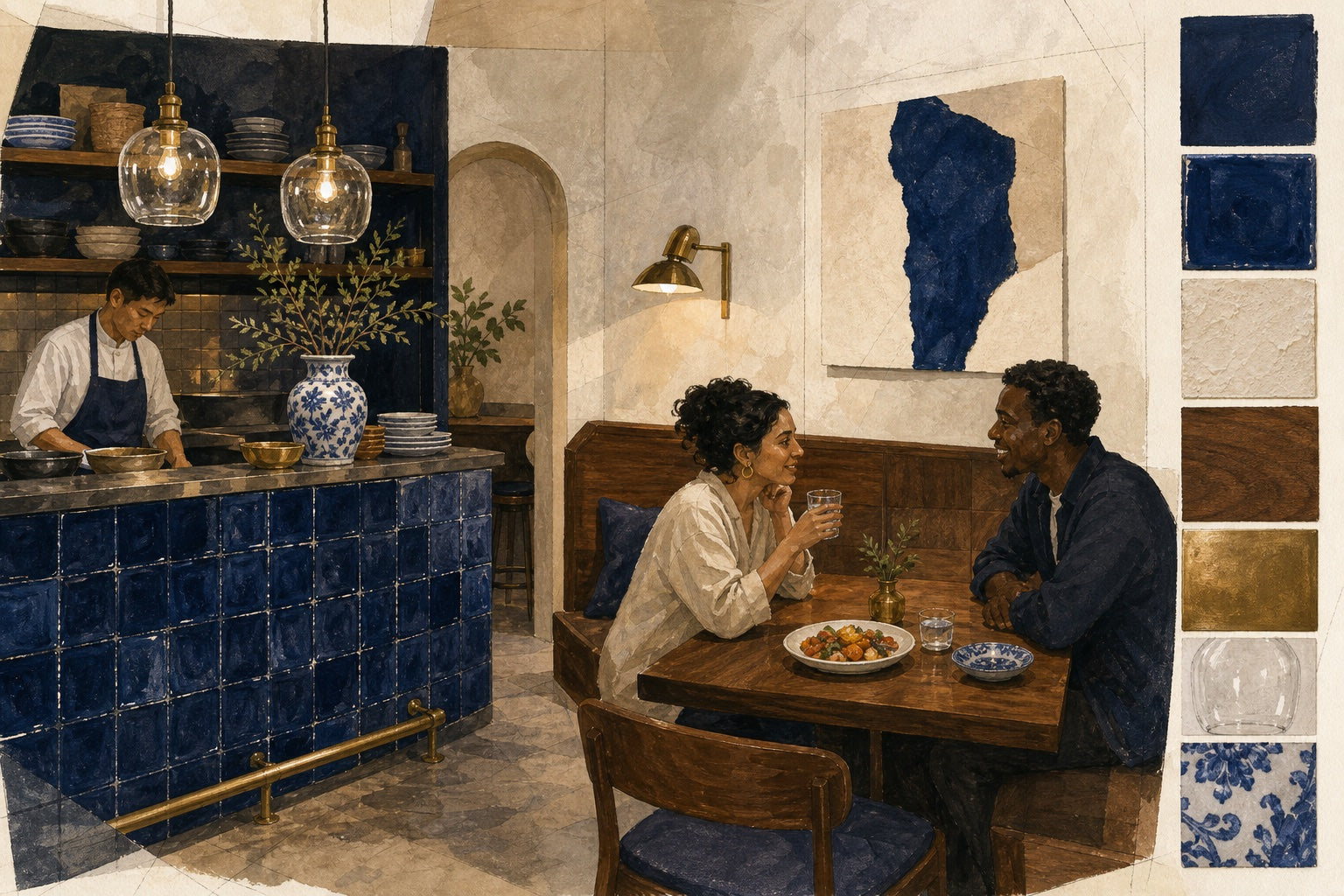
The short version: give blue one job and three good neighbours
Start with a blue that has enough depth to survive evening dimming—inky navy, mineral blue, or violet-leaning indigo are useful samples, not automatic answers. Then build the room around four roles:
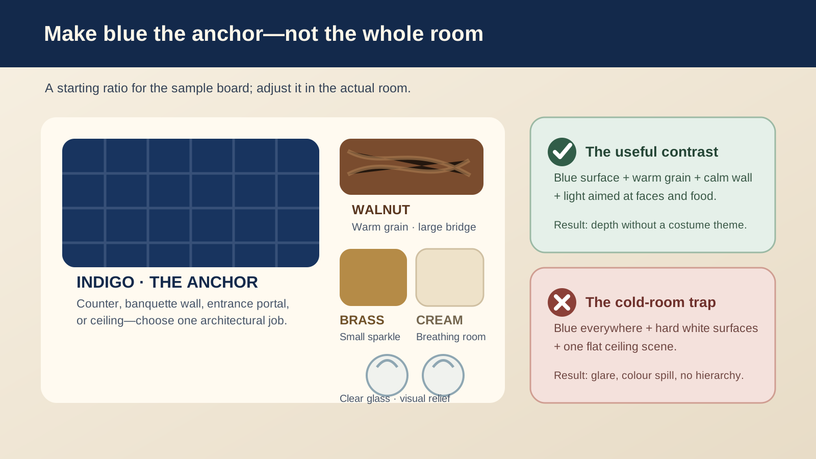
- The anchor: one blue counter, banquette wall, entrance portal, or ceiling.
- The warm bridge: walnut, oak, leather, cork, or another material with visible warm grain.
- The breathing surface: cream plaster, warm off-white, pale stone, or a similarly calm field.
- The small reflection: aged brass, warm metal, or clear glass used in limited points.
This is not a fixed colour ratio. It is a way to stop one colour from having to do every visual job. The balance map below is a starting conversation for the sample board.
Choose the blue by behaviour, not by name
Paint names are unreliable design instructions. “Navy” may lean green, violet, grey, or almost black. A pale powder blue may look airy at noon and tired after sunset. Cobalt may become the most saturated object in every phone photograph. Deep indigo may read as rich on a textured tile and flat on a large smooth wall.
Begin with three physical samples that are meaningfully different—not three almost-identical chips. Make the leading sample at least poster size, because a two-inch card cannot show how a dark colour absorbs light across a wall.
Check undertone beside the food
Put the sample next to a white plate, your menu paper, a water glass, a napkin, and two representative dishes. Add something warm in colour: bread, tomato, grilled food, curry, red wine, or the ingredient that matters to your menu. You are not trying to make every dish look like a commercial photograph. You are checking whether it remains recognisable and appealing.
Then add a person in neutral clothing. Look at their face with your eyes and through a phone camera. If the wall seems more important than the guest, reduce its area, lower its saturation, move it farther from the table, or introduce a warmer surface before abandoning blue altogether.
The US Department of Energy’s explanation of LED colour quality is a useful guardrail here: correlated colour temperature and colour fidelity describe different things, and a single number does not predict the whole visual result. In practice, compare the actual lamp, shade, dimming state, and material sample together.
Put blue where it can organise the room
Colour feels deliberate when guests can understand why it is there. A blue element might:
- lead the eye along a narrow plan as a tiled counter;
- make a banquette wall the room’s visual address;
- frame the entrance before the palette becomes quieter inside;
- lower a tall ceiling visually without covering the table plane;
- identify a service or retail zone without adding more signs.
Pick one of those jobs first. Repeating the same blue on every unrelated surface may satisfy the mood board, but it often removes hierarchy from the real room.
The Indigo Tea House is useful as a concept study because its indigo counter behaves like a spine. The colour protects and identifies a working surface, while cream plaster and walnut carry the dining side. Treat the imagery as a design prompt, not evidence of a completed site or an exact product finish.
Use variation on a large blue surface
Large, flat, dark paint can turn into a visual hole when the light drops. Hand-glazed tile, limewash, woven fabric, or stained timber breaks a big field into small changes of depth and sheen. That variation gives warm light something to reveal.
Choose one tactile blue surface, not five. A restaurant still has to clean, repair, and touch up the material. Ask the supplier for the real cleaning and maintenance method, mock up the grout or joint, and view the finish from a seated angle. Texture that looks subtle on a sample can become busy when multiplied across a long wall.
Warm blue with material, not an orange accent on everything
Blue and orange are opposites, but a literal complementary palette can turn a quiet room into a high-energy brand scheme. Hospitality warmth is often more convincing when it arrives gradually:
- walnut or oak provides a broad warm field;
- cream plaster gives reflected light a soft landing place;
- aged brass adds small highlights rather than another big colour block;
- clear or lightly textured glass keeps the ceiling visually open;
- porcelain repeats blue at a smaller scale and introduces white contrast.
Red berries, rust textiles, or terracotta can be useful, but they should have a named role. If they exist only because the palette “needs orange,” remove them from the first sample board and see whether grain, metal, and light already solve the problem.
Use décor once, where somebody can look at it without walking around it. A vase at the entrance or one blue-and-white piece on a protected shelf can connect the palette. Ten versions scattered across tables usually create a clearing and breakage problem instead of a design story.
Light the guest and the blue surface as separate jobs
A ceiling grid asked to light the room, food, counter, artwork, and route will usually do all five jobs badly. Dark blue reflects less light than a pale neighbour, so a flat scheme can make the colour look colder while producing more glare.
Use the same diagnostic approach as the restaurant lighting layers field guide:
- ambient light holds the room together;
- service light supports the host, payment, pass, steps, and routes;
- focal light helps a plate, menu, or face;
- accent light reveals the blue texture or artwork.
The blue surface and the person beside it may need different aiming, shielding, or output. Do not make the wall brighter simply because a nearby menu is shadowed. Solve the menu locally and let the wall remain part of the atmosphere.
The Illuminating Engineering Society’s discussion of layered restaurant lighting is a useful professional perspective. It reinforces the practical point: the table, surrounding surfaces, and other light layers combine into the guest’s experience.
Test colour temperature in the complete scene
Warm light often helps indigo feel hospitable, but “warmer” is not automatically better. An overly amber source can dirty a blue tile and flatten blue-and-white ceramics. A cooler source can leave timber and skin looking less inviting. The right answer depends on the source, spectral quality, shade, dimmer, and reflected surfaces.
Mock up the intended source with the real sample. Check it at the lowest approved service state and at cleaning brightness. If it shifts abruptly, flickers, or changes character at low output, involve the lighting supplier or qualified professional before repeating that combination across the room. Our colour-temperature guide explains why warmth, brightness, and colour rendering should not be treated as the same control.
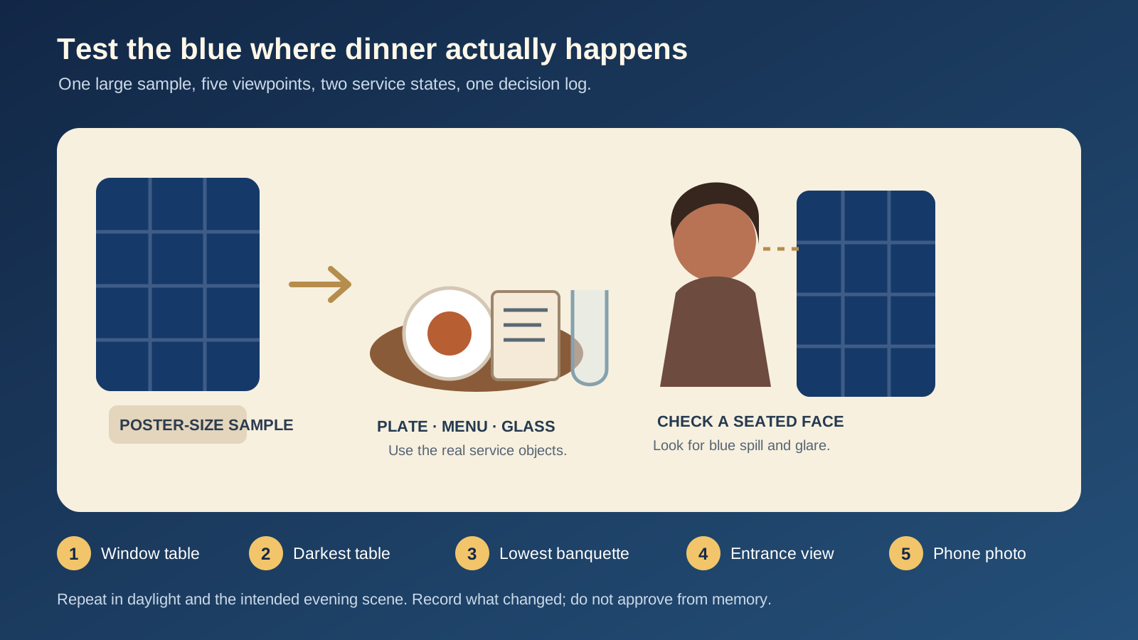
Run the five-view sample test
Do this before ordering a room quantity. It takes one large sample, a set table, a phone camera, and a simple log.
- Build the scene. Use the real plate, menu, napkin, glassware, tabletop, and intended lamp or mock-up.
- Check five views. Sit at the window table, darkest table, lowest banquette position, entrance view, and one seat facing the blue surface.
- Photograph from the opposite seat. Lock the position and compare changes from the same viewpoint. Phone processing is not objective, but it reliably reveals dominant colour spill and visible glare.
- Repeat in two states. Test in useful daylight and in the intended evening scene, not only under work lights.
- Record one decision. Note the sample, source, dimming state, viewpoint, problem, and next change. Do not approve from memory.
A failure table for the mock-up
| What you see | Likely cause to test first | Smallest useful experiment |
|---|---|---|
| The blue becomes black at dinner | Surface is too dark for its area or receives no useful light | Light a smaller section, reduce the blue area, or compare a lighter sample |
| Faces look blue in phone photos | Saturated surface is too close or receiving broad spill | Move the sample, reduce its area, shield the source, or add a warm neutral neighbour |
| Food looks dull but the room feels warm | Source renders key colours poorly or is overly amber | Compare the actual dish under a different compatible source; do not judge CCT alone |
| Brass looks like scattered dots | Too many small accents compete | Keep one repeated metal detail and remove the unrelated pieces |
| The room feels narrow | Every edge disappears into the dark field | Reveal one far boundary and keep the aisle visually quiet |
| Blue tile becomes busy | Variation, grout, and reflected highlights multiply | Mock up a larger section with the intended joint and light angle |
This table is meant to slow down shopping. A failed mock-up is cheaper and more informative than a room full of installed guesses.
Keep a small dark-blue restaurant from closing in
Dark colour can create intimacy, but a narrow plan still needs direction. Give the eye a path:
- use the blue counter or banquette as a visual spine;
- keep pendants aligned to fixed tables or the working counter, not the centre of the aisle;
- reveal one far wall, artwork, or shelf so the room has depth;
- preserve a cream wall or ceiling where warm light can land;
- keep tall décor and hanging objects out of the main route.
The small-restaurant lighting zones guide helps separate entrance, table, counter, wall, and circulation problems. If pendants are part of the scheme, run the sightline checks in the pendant-height guide before approving suspension length.
What to buy only after the test
Once the sample survives the food, face, and route checks, shortlist the product category that performs the missing job:
- Pendant lights can localise a counter or fixed table, but verify scale, suspension, lamp position, controls, and seated glare.
- Wall lights can reveal a texture or far boundary, but check projection, reflection, mounting, and cleaning access.
- Table lamps can help a documented dark table, but confirm stability, runtime, charging, output, and place-setting space.
Do not choose the room from product thumbnails. Confirm current dimensions, finishes, electrical requirements, availability, and maintenance information on the specific product page, then test a representative unit where practical.
The pre-installation decision
A blue restaurant is ready to move forward when the team can answer five questions without referring to the mood board:
- What architectural job does the blue perform?
- Which warm material connects it to the tables and people?
- Where does calm cream or another light surface give the room breathing space?
- Which source lights the guest and food, and which reveals the blue surface?
- What did the same sample do at the five real viewpoints in daylight and the evening scene?
If those answers are clear, blue stops being a risky colour choice and becomes a useful piece of the plan. Give it one role, test it with real service objects, and let the room—not the screen—make the final decision.
Keep reading

guest-experience
Restaurant Restroom Cleaning Checklist and Inspection Log
Use this restaurant restroom cleaning checklist for opening, service inspections, supplies, fixtures, floors, waste, incidents, and closing records.

dining-room-operations
Restaurant Dining Room Cleaning Checklist: Turn to Close
Use this restaurant dining room cleaning checklist for table turns, high-touch points, spills, service stations, floors, opening, and close.

food-safety
Restaurant Kitchen Cleaning Checklist for Every Shift
Use this restaurant kitchen cleaning checklist to control opening, between-task, four-hour, closing, and weekly work without vague assignments.