
Restaurant Lighting CRI and R9: Fix Dull-Looking Food
Why food and skin look wrong under cheap LEDs. What CRI measures, why R9 decides how red food reads, and a plate test to run before you buy forty fittings.

By the Resto Glow Studio team · Published 5 August 2026 · Last reviewed 5 August 2026
There is a complaint every kitchen makes and almost no dining room investigates: the food looks better on the pass than on the table. The chef blames the plating. The manager blames the chef. Neither is usually right.
What has changed between the pass and the table is the light — and specifically, the light's ability to give a surface back to the eye the way a familiar source would. That property has a name, a metric, and a well-known blind spot that happens to sit exactly where restaurant food lives.
This post owns colour rendering. Our restaurant lighting colour temperature guide owns colour appearance — the Kelvin question, which number suits which room, and how to build service scenes around it. The two are genuinely different properties, and buying well on one while ignoring the other is how a room ends up warm, expensive and unappetising.
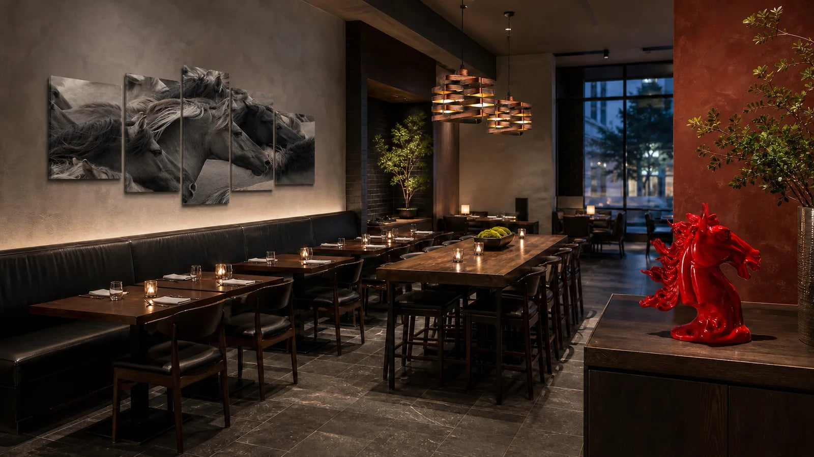
Light goes in, colour comes out
The physical premise is simpler than the metrics built on top of it. As the DOE solid-state lighting fact sheet puts it: "Objects are not inherently colored, but rather reflect different proportions of radiant energy. Thus, if the light incident on a surface changes, the apparent color of the object may change" (LED Color Characteristics, PNNL-SA-84900, January 2012).
A tomato is not red. A tomato reflects a particular slice of what you shine at it. If your lamp emits very little energy in that slice, the tomato has nothing to give back, and it lands on the table looking like something a week older than it is.
That is the whole problem in one sentence, and it explains why colour temperature cannot solve it. Kelvin describes the light leaving the fitting. Rendering describes what comes back off the plate.
What CRI actually measures — and what it does not
Colour rendition, according to the same fact sheet, has at least three aspects relevant to choosing a light source: fidelity (colours appear as they would under a familiar reference source), appeal (objects appear more pleasing, sometimes described as vivid or flattering), and discrimination (the ability to tell a wide range of colours apart when seen together).
The colour rendering index measures the first one only. It is a fidelity metric, and the fact sheet is explicit that it "does not address the other two aspects of color rendering".
That matters more in a restaurant than almost anywhere else, because a dining room is not primarily buying accuracy. It is buying appeal. The fact sheet even concedes the awkward corollary: "a source with a very low CRI may actually render objects so that they are more pleasing to an observer than a source with higher CRI."
So CRI is a screening tool. It narrows a shortlist. It does not choose for you.
The mechanics: CRI averages the individual scores for eight standard test colours — samples of moderate lightness with roughly equal differences in hue. A score of 100 means the source renders colours identically to the reference. The scale typically runs 0 to 100, though negative scores are possible.
The eight it counts, and the six it leaves out
Here is the part that decides how your food looks, and it is a structural feature of the metric rather than a manufacturer's failing.

Alongside the eight averaged samples sit six special colour rendering indices, R9 through R14. Each rests on a single test colour. And, in the fact sheet's words, "they are not used for calculation of CRI but may be used for supplemental analysis when necessary."
The eight are moderate. The saturated ones are the extras. Which means a lamp can average well across eight middling colours while being weak precisely where a plate of food, a glass of wine and a human face live.
DOE says this outright on its LED Basics page: CRI "is far from a perfect metric and is especially poor at predicting the fidelity of saturated reds, for which the supplemental value R9 is often used" (LED Basics).
R9, the number your kitchen cares about
R9 is the "strong red" sample. The fact sheet explains why it earns special attention: the rendition of saturated red "is particularly important for the appearance of skin tones, among other materials."
Skin. That is the reason a dining room should care, before we even get to the tomatoes.
There is also a useful piece of interpretation guidance in the same passage: "An R9 score greater than 0 is generally considered acceptable since the color space used in the CIE Test-Color Method often causes color shifts in the red region to be exaggerated." Note what that says and what it does not. It offers a floor and an explanation for why the number reads harshly. It does not hand you a purchasing threshold — and we are not going to invent one for you.
What weak red rendering looks like in a real room is oddly specific, and once you have seen it you cannot unsee it.

Tomatoes go brown. Rare beef reads as overcooked. Charcuterie goes grey at the edges. Red wine loses depth and sits in the glass looking flat. And faces lose the blood underneath them, which nobody consciously notices and everybody responds to.
Meanwhile the linen still looks fine, the herbs still look green, and the room photographs acceptably — which is exactly why the problem survives so long before anyone diagnoses it.
Two traps that catch careful buyers
Trap one: comparing CRI across colour temperatures. CRI is reference-based, and the reference changes. Below 5000K it is black body radiation; above that it is a mathematical model of daylight. The fact sheet warns that "comparing the CRI for sources with different CCTs should only be done with great caution", and that because it is reference-based, "it is not appropriate to compare the CRI values for sources of very different CCTs."
So a 2700K lamp claiming CRI 90 and a 4000K lamp claiming CRI 90 are not making the same claim. Compare within a colour temperature, then judge across with your eyes — a comparison that recurs in the 2700K versus 3000K decision.
Trap two: the same score, opposite behaviour. Two sources can share a CCT and a CRI and still render colours differently — the fact sheet says so plainly. DOE's TM-30 material makes the mechanism visible: two sources scoring CRI 80 "might be moving in opposite directions, but they both have the same score", with one desaturating colours and the other enhancing them.

That is what the newer measurement set adds. A fidelity index, Rf, runs from 0 to 100, with higher scores meaning the source renders colours more similarly to the reference. A gamut index, Rg, describes direction: above 100 indicates an average increase in saturation, below 100 an average decrease. DOE describes the two together, from IES TM-30, as providing "a more comprehensive evaluation of color rendering" than CRI alone.
For a restaurant, direction is not a technicality. A source that flattens saturation makes an entire menu look tired. A source that lifts it can make the same menu look vivid — or, pushed too far, artificial.
What to actually ask for
Three numbers and one conversation.
| Ask for | Why |
|---|---|
| CRI | Screening only. It narrows a shortlist |
| R9 | Saturated red — food and skin |
| Rf and Rg | Fidelity plus direction, if the manufacturer publishes them |
On quality bands, take the sources at their word rather than ours. The DOE fact sheet characterises a source with a CRI in the 70s as acceptable for interior applications, the 80s as good and the 90s as excellent. DOE's LED Basics page states that "in general, a minimum CRI of 80 is recommended for interior lighting", and that "CRI of 90 or higher indicates excellent color fidelity". Both are general interior-lighting guidance, not a restaurant requirement and not code.
Then the conversation: R9 is rarely printed. Lighting Facts labels carry lumen output, watts, efficacy, CRI and CCT, and DOE's advice for applications where colour performance is critical is that "additional information should be obtained from the manufacturer." A restaurant is such an application. Ask, in writing, and file the answer with the order — the six-line purchase specification in our warm white versus cool white post has a place for it.
The plate test
Every source we have read arrives at the same conclusion, and it is worth stating before the checklist. The fact sheet: "Ultimately, subjective visual evaluation remains the most reliable means of ensuring adequate color quality." And, on significant purchases where colour appearance matters, "there is no substitute for visual evaluation."
Numbers narrow the shortlist. Your own food under the actual lamp settles it.

Put a ripe tomato or a red sauce under it first, because that is the fastest failure. Add a pink or rare protein — beef, tuna, salmon, charcuterie — since weak red shows there before anywhere else. Add herbs and leaves, because greens carry freshness and a grey-green salad reads as yesterday's prep whatever the ticket says.
Add something white — a plate, the linen, a meringue. Whites are where a green or pink cast gives itself away: a tint problem rather than a rendering one, but you will see both in the same glance. Add a glass of red wine, which should read deep and red at the service level rather than black or flat brown.
Add a hand and a face at seated height, with several skin tones if you can — the step people skip, and the reason R9 is in this conversation at all. Finally, add the menu card and the card machine, judged by a guest rather than by whoever chose the fittings.
Then write down the lamp, the CRI, the R9 if you have it, the dimmer position, the date and who judged it. One page. On file.
Where rendering quietly fails after installation
Two things degrade a room that passed its test.
Dimming. A source can render acceptably at full output and badly at the level you actually trade at. Some warm-dim systems combine white LEDs with narrow-band amber ones, and at the very low end of the range only the amber is still producing light — DOE warns this can make skin tones and room finishes "look as eerie as they would under high-pressure sodium lamps", and recommends checking CRI near the lowest dimming setting. That whole failure mode gets its own treatment in our dim-to-warm post.
Replacement. Rendering is a property of a product, not of a Kelvin figure. A failed lamp replaced with whatever the wholesaler had in stock can drop a zone's rendering without changing its colour temperature — and because the room's appearance has not shifted, nobody connects the complaint to the maintenance log.
What to buy, and where to look first
Pendants, because they sit closest to the plate and their light lands on food and faces. Browse pendant lights, and see the pendant height guide for how hanging height changes what reaches the cloth.
Table lamps, because a small pool at the cover is the light a guest reads their food by. Portable lamps are also the cheapest way to sample a candidate source on a dressed table tonight — our rechargeable restaurant table lamps guide covers battery duration and charging routines. Browse table lamps.
Wall lights, because perimeter light does the work on faces in a low room. Browse wall lights.
Decorative filament bulbs are the honest exception: seen rather than seen-by, and not where the rendering budget belongs.
Start in Warm & Intimate for dinner-led rooms and Bright & Social for daytime trade. Everything sits under restaurant lighting.
Restaurant lighting CRI FAQ
What CRI do I need for a restaurant?
There is no restaurant-specific requirement in the sources we can verify. DOE's general interior guidance is a minimum CRI of 80, with 90 or higher indicating excellent colour fidelity, and its fact sheet describes the 70s as acceptable, the 80s as good and the 90s as excellent for interiors. Treat those as screening bands, then judge your own food under the lamp.
What is R9 and why does it matter for food?
R9 is a special colour rendering index based on a single "strong red" test colour. It is not included in the CRI average. DOE notes that saturated red rendition is particularly important for the appearance of skin tones, among other materials — which makes it the number that decides whether tomatoes, rare protein, red wine and faces read properly in your room.
Is a high CRI bulb always better for food?
No. CRI measures fidelity only, not appeal or the ability to tell colours apart, and DOE's fact sheet notes a lower-CRI source can sometimes render objects more pleasingly than a higher-CRI one. Two sources with the same CRI can also move saturation in opposite directions. Use CRI to shortlist, then look at your actual menu.
Why does my food look better in the kitchen than the dining room?
Usually because the two rooms are lit by different sources with different spectra. Kitchen lighting tends to be specified for task performance and dining-room lighting for atmosphere, and a source can be warm and dim without rendering saturated reds well. Carry a plate from the pass to a table and compare the same food in both places.
Does dimming change colour rendering?
It can. Some warm-dim products mix white and narrow-band amber LEDs, and near the bottom of the range the amber can dominate, which DOE warns can make skin and finishes look eerie. DOE's rule of thumb is to check colour rendering near the lowest dimming setting rather than at full output — and to judge it with your eyes in a mock-up.
Further reading in this series: warm white vs cool white for the label problem, 2700K vs 3000K for the specification decision, and dim-to-warm lighting for how rendering behaves on the way down. Colour appearance itself lives in the restaurant lighting colour temperature guide. Primary sources: DOE's LED Color Characteristics fact sheet, LED Basics and its TM-30 text-alternative page.
Keep reading

guest-experience
Restaurant Restroom Cleaning Checklist and Inspection Log
Use this restaurant restroom cleaning checklist for opening, service inspections, supplies, fixtures, floors, waste, incidents, and closing records.

dining-room-operations
Restaurant Dining Room Cleaning Checklist: Turn to Close
Use this restaurant dining room cleaning checklist for table turns, high-touch points, spills, service stations, floors, opening, and close.

food-safety
Restaurant Kitchen Cleaning Checklist for Every Shift
Use this restaurant kitchen cleaning checklist to control opening, between-task, four-hour, closing, and weekly work without vague assignments.