
Restaurant Warm White vs Cool White: Order It Right
Warm white or cool white for your restaurant? What the shelf labels really mean, why two warm whites rarely match, and the six lines your lamp order needs.

By the Resto Glow Studio team · Published 5 August 2026 · Last reviewed 5 August 2026
"Warm white" is the most requested thing in restaurant lighting and one of the least useful things to write on an order. It describes how the light looks. It does not tell a supplier what to ship, it does not tell an electrician what to wire, and it will not help you in two years when four lamps have failed and the replacements arrive looking subtly wrong.
This post owns the words. Our restaurant lighting colour temperature guide owns the numbers — which nominal colour temperature suits which kind of room, from a 2200K accent through to 4000K task light, and how to build service scenes around that choice. Start there if the question you are actually asking is which Kelvin.
Stay here if the question is the one underneath it: what "warm white" and "cool white" actually mean, why two lamps that both say warm white can look nothing alike on your linen, and what to put on a purchase order so the second delivery matches the first.
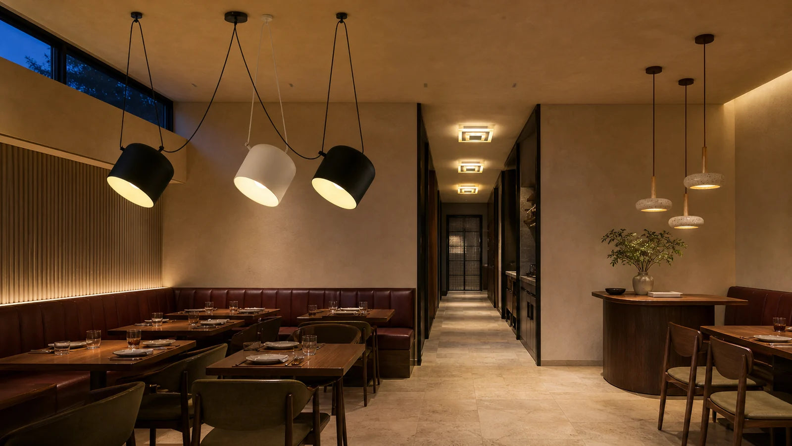
"Warm" and "cool" describe the light, not the food
Start with what the words are pointing at. The US Department of Energy's solid-state lighting fact sheet puts it plainly: colour temperature "characterizes how 'cool' (bluish) or how 'warm' (yellowish) nominally white light appears" (LED Color Characteristics, PNNL-SA-84900, January 2012).
Correlated colour temperature, or CCT, relates a source's appearance to a theoretical black body heated to high temperatures. As that black body gets hotter it turns red, then orange, yellow, white and finally blue. The Kelvin figure on a lamp is the temperature at which the heated black body most closely matches the colour of that lamp.
There is a sentence in the same document that matters more to a restaurant than any of that physics. CCT "characterizes the color of the emitted light, not the color of illuminated objects."
Read it twice, because it dismantles the most common assumption in the category. Warm white is not a promise that your food will look good. It is a statement about the light leaving the fitting. How your tomatoes, your rare beef and your guests' faces come back to the eye is a different property with a different measurement, and we have given it its own post on CRI and R9.

The shelf label has no fixed edge
Here is the awkward part. The Kelvin numbers are standardised. The words are not.
Standards work in nominal colour temperatures, each with a defined area of chromaticity around the black body curve — the DOE fact sheet footnotes ANSI C78.377 for the full specification, and names NEMA's SSL-3-2010 as the LED binning standard built on it. That is what a manufacturer is actually held to.
"Warm white", "soft white", "bright white" and "daylight" are what marketing departments print on cartons so a shopper does not have to think in Kelvin. They are useful shorthand in a hardware aisle. They are not a specification, and nobody is obliged to draw the boundary in the same place you would.
The practical consequence is small and expensive: two suppliers can both honour "warm white" on your order and ship light you would never have chosen to sit in the same room.
Why two warm whites rarely match
Even when both lamps carry the same Kelvin number, they can still fail to match — and this is the failure operators actually experience, usually six months after opening.
Colour temperature collapses a whole spectral power distribution into one number. The fact sheet is direct about what that costs: "two sources with the same CCT can look different, one appearing greenish and the other appearing pinkish."
The metric that catches this is Duv, which quantifies how far a source's chromaticity sits from a black body radiator of equal CCT. A positive Duv puts the source above the black body curve, appearing slightly greenish. A negative Duv puts it below, appearing slightly pinkish. ANSI publishes Duv tolerances for white-light LED products; the fact sheet notes that the variability allowed by NEMA's bin sizes is roughly equivalent to the chromaticity variation seen in compact fluorescent lamps of the period, and that some manufacturers hold themselves to tighter tolerances than the standard requires.

In a restaurant this shows up in three places, in this order:
- White linen. The single most sensitive surface in the room. A green-side warm white pushes it olive; a pink-side warm white pushes it rosy.
- Skin. Guests will not name it. They will simply prefer one side of the room.
- White plates. Especially against a dark table, where the plate is doing most of the reflecting.
There is a second mechanism worth knowing about, because it explains why a room can drift without anyone changing a lamp. LED products are sorted into bins after manufacture on chromaticity, output and sometimes forward voltage, and the fact sheet notes that colour characteristics can change as sources age — through phosphor degradation, or through uneven lumen depreciation across the primaries in a mixed-LED product. A room lamped in one batch ages as one batch. A room lamped in four batches ages in four directions.
What warm white cannot fix
A surprising number of "we need warmer light" briefs turn out to be about something else entirely. Colour appearance is one variable among several, and swapping it will not repair the others.
| The complaint | What it usually is |
|---|---|
| "It feels clinical" | Colour appearance — genuinely a Kelvin question |
| "Guests can't read the menu" | Level and distribution, not colour |
| "It's harsh" | Glare from an exposed source, not colour |
| "The food looks dull" | Colour rendering, not colour appearance |
| "It's gloomy but the tables are bright" | Unlit walls and perimeter |
If your complaint is in rows two or five, the fix is level and layer, not Kelvin. Our foot-candle chart by zone covers what the light on a surface should measure, and the layering guide covers how the layers should divide the work. Row three is a shade and aiming problem. Row four is rendering.
Where cool white earns its place
Cool white is not the enemy of atmosphere. It is simply a task decision that has been marketed as a mood decision.
The honest framing is this: warm appearance is what most dining rooms are choosing when they choose an atmosphere, and cooler appearance is what most work is choosing when it needs to be done quickly and accurately. A prep bench, a dish pit, a dry store, a cleaning pass at midnight — none of those are experiences, and none of them benefit from being lit like a dinner service.
Two things follow.
First, back of house and front of house are allowed to disagree. They are different rooms doing different jobs, and a transition between them is a design element rather than an inconsistency.
Second, if you are choosing a cooler appearance for a front-of-house space, choose it for a reason you can name — a daylit room that has to hold its own against big glazing until late in the afternoon, a counter where legibility carries the trade, a display case where whites need to read as white. "It looks cleaner" is a reason. "It was on the shelf" is not.
Which of the two warm ends you land on is the most common real decision in the category, and it has its own post: 2700K vs 3000K.
From shelf word to purchase line
Here is the translation. Six lines, written once, kept with the electrical drawings rather than in a manager's inbox.

- Nominal colour temperature. One number, not a word and not a range.
- Tint tolerance and bin. The Duv tolerance or chromaticity bin, so nothing arrives green or pink relative to what is already up.
- Colour rendering, including R9. CRI is usually on the label. R9 usually is not, and it is the one that decides how red food reads — our CRI post explains why.
- Dimming behaviour. Does the source hold its colour as it dims, or warm as it dims? These are different products with different wiring, covered in our dim-to-warm post.
- Control protocol. Phase-cut, 0–10V, DALI, DMX or wireless. Decided before first fix, not after.
- Reorder clause. Same family, same bin, on every replacement, in writing.
The DOE fact sheet notes that Lighting Facts labels carry lumen output, watts, efficacy, CRI and CCT — a good starting point, but it also says that where colour performance is critical you should get additional information from the manufacturer. Lines two, three and four are that additional information. You have to ask for them.
Before you reorder forty lamps
Most colour-temperature disasters are not specification failures. They are maintenance failures — a lamp fails, someone buys what the wholesaler had, and eighteen months later the room has three different whites in it and nobody can say when that happened.

The audit is deliberately dull. Count what is up there and write down make, model and colour temperature. Photograph the room cold, from a seat, before anything changes. Sample a whole zone rather than one lamp in a row, because a single odd fitting always reads as a fault rather than as a difference. Then sit down — guest side, seated height — and judge linen, skin and food rather than the fitting.
And then write it down, because the person who does the next relamp will not be you.
What to buy, and where to test it
Colour appearance is easiest to test on the layer that is easiest to move.
Table lamps are the cheapest honest test in the building. A cordless lamp lets you put a candidate colour on a dressed table tonight, with your real linen and your real plates, without touching a circuit. One caution: portable lamps hold their own colour independently of the room's dimmer, so a lamp chosen in isolation can end up as the odd white at the last seating. Our rechargeable restaurant table lamps guide covers battery life, charging routines and how these behave in service. Browse table lamps, or start with the Modern Curved LED Accent Table Lamp.
Pendants are where colour appearance meets the plate, because they are close to the table and their shade geometry decides how much light lands on the cloth. The Amber Pendant Light is a useful reference for how much a coloured shade contributes on top of the source's own appearance — a point worth remembering, since the shade can shift the perceived warmth of the pool regardless of what the lamp inside is rated. Browse pendant lights.
Wall lights are the layer that decides whether a room reads gloomy. Lighting the perimeter raises perceived brightness a long way without lifting the level at the tables. The Solar Eclipse LED Restaurant Wall Light is one option; browse wall lights.
For a room being specified warm from the start, the Warm & Intimate edit is the right place to begin. For daylit, all-day rooms, start in Bright & Social. Everything sits under restaurant lighting.
Warm white vs cool white FAQ
What colour temperature is warm white?
There is no standardised Kelvin range behind the retail phrase. Standards define nominal colour temperatures and the chromaticity areas around them; the words on the carton are lamp-industry shorthand layered on top. Ask for the nominal Kelvin figure and the tint tolerance rather than the label word, and see our colour temperature guide for which number suits which room.
Is warm white or cool white better for a restaurant?
Neither is better in the abstract. Warmer appearance suits dinner-led rooms with timber, brass and leather; cooler appearance suits task areas, daylit spaces and counters where legibility carries the trade. Most restaurants need both, in different zones. Decide zone by zone against what people are doing there, not by picking one number for the building.
Why do my two warm white bulbs look different?
Because colour temperature is one number describing a whole spectrum. DOE's fact sheet notes that two sources with the same CCT can look different — one greenish, one pinkish — depending on where they sit relative to the black body curve. That distance is measured as Duv. Ask suppliers for the Duv tolerance or the chromaticity bin, not just the Kelvin figure.
Does warm white light make food look better?
Not by itself. Colour temperature describes the light leaving the fitting, not how objects come back to the eye. Colour rendering is the separate property that decides whether a tomato reads red, and CRI is especially weak at predicting saturated reds. See our CRI and R9 post before you buy on Kelvin alone.
Can I mix warm white and cool white in one restaurant?
Yes, when each has a defined territory — a warm dining room and a cooler prep line, for example. Problems start when the two meet inside one sightline with no transition, or when a relamp introduces a second white into a zone that had one. Give every zone a single specification and write down which zone gets which.
Further reading in this series: 2700K vs 3000K for the narrow decision most rooms actually face, CRI and R9 for how food renders, and dim-to-warm lighting for what happens to colour as the room dims. The Kelvin-by-Kelvin overview lives in the restaurant lighting colour temperature guide. Primary source for this post: the US Department of Energy's LED Color Characteristics fact sheet.
Keep reading

guest-experience
Restaurant Restroom Cleaning Checklist and Inspection Log
Use this restaurant restroom cleaning checklist for opening, service inspections, supplies, fixtures, floors, waste, incidents, and closing records.

dining-room-operations
Restaurant Dining Room Cleaning Checklist: Turn to Close
Use this restaurant dining room cleaning checklist for table turns, high-touch points, spills, service stations, floors, opening, and close.

food-safety
Restaurant Kitchen Cleaning Checklist for Every Shift
Use this restaurant kitchen cleaning checklist to control opening, between-task, four-hour, closing, and weekly work without vague assignments.