
Vintage Tin Signs for Restaurants & Bars: Styling Guide
A practical tin-sign wall guide covering theme, viewing distance, measured layouts, safer fixing, edge inspection, cleaning and daylight exposure.

By Resto Glow Studio · Published 3 August 2026 · Last updated 3 August 2026
A few isolated signs can look accidental; a measured group reads as one wall treatment. The difference is the layout, not the number on the product page.
This guide covers the decisions to make before ordering: reproduction versus period originals, theme, group size, spacing, fixing, cleaning, and sun exposure. Use the size table as a mock-up starting point, then test the complete outline on your wall at full scale.
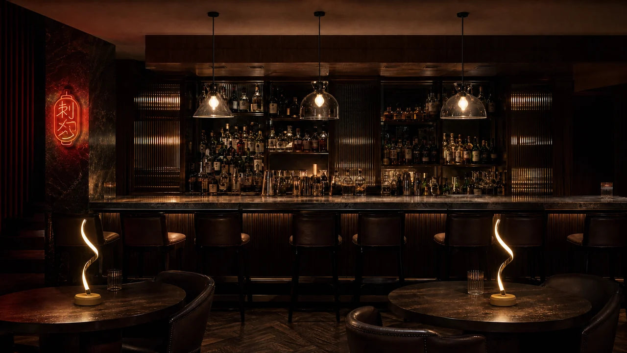
Why tin signs earn their wall
Tin signs carry small-scale information that a single canvas cannot: dates, illustrations, type, and references guests can read at close range. That makes them useful on long circulation walls and back-bar runs where one large image would have to work from several viewing distances.
Their practical advantage is modularity. A damaged reproduction can be replaced without remaking the whole group, and a layout can grow by one measured cluster at a time. Keep all signs and fixings clear of exit signage, required clearances, and working surfaces.
Authentic or reproduction: what an operator should actually buy
There are two markets here and they barely overlap.
The collector market deals in genuine period advertising, graded on rust, gloss and edge chipping. Auction houses like Richmond Auctions run this world, and antique dealers such as 1stDibs list restaurant signage at dealer level. These pieces are bought for provenance and condition, and priced accordingly.
The decor market sells reproductions: new printed metal, distressed on purpose, in a handful of standard sizes. Bought as art, they are honest. Bought as antiques, they are a disappointment waiting for a guest who knows better.
If provenance matters to the concept, consider one documented period piece with reproductions around it. Put the original where guests can view it closely, give it visual space, and label it accurately if you mention its history. Reproductions can then provide scale without pretending to be antiques.
One check before you commit to a genuine piece: whether its rust is stable or actively flaking onto a surface where food is served. If that is uncertain, frame it behind glass or hang it away from the pass.
Choose a theme before you choose a sign
The failure mode of sign walls is not ugliness. It is incoherence — nine signs, nine subjects, no argument. Pick one lane and stay in it. Mixed eras are fine; mixed worlds are not.
Diner and American roadside
Soda fountains, motor oil, route markers, roadside motels, automotive service. Bold sans-serif type, primary reds and blues, heavy black keylines. This theme carries best in bright rooms with hard surfaces — tile, chrome, laminate, vinyl booths — because the graphics are loud enough to hold their own against daylight. It is also the most photographed theme, which matters if your walls are doing marketing work.
Keep the palette tight. Three dominant colours across the whole wall, repeated, reads as a collection. Nine unrelated colour schemes reads as a car boot sale.
Bar and cocktail lounge
Spirits advertising, cocktail-recipe plates, aperitif and vermouth graphics, neon-adjacent typography. This is the strongest theme for dim rooms because the signs are read at close range under low light — guests are at the bar, three feet away, not across a dining room.
Our own cocktail bar tin sign sits in this lane: printed metal, bar-and-cocktail subject matter, sized to hang in a group rather than perform alone. Signs like it work best repeated — two or three across a back-bar run, broken up by a shelf or a bottle line. See the treatment in The Midnight Bar, and a quieter, more louche version of it in The Nightjar Lounge.
BBQ, brewery and coffeehouse
Smokehouse and butcher graphics, brewery and beer-hall plates, roastery and coffee-grinder advertising. These themes lean on browns, creams, ochres and dark greens, which means they sit comfortably in rooms already built from timber, brick and leather — and they will disappear against a dark wall unless you light them.
Match the theme to what you actually serve. A coffee-roastery wall in a room that serves cocktails after six reads as a mistake by 7pm.

The numbers: how many, what size, how far apart
The ranges below are Resto Glow house starting points, not installation standards. Mock them up at full size and adjust for the furniture, sightline, and sign dimensions you actually have.
Three rules do most of the work:
- Use at least two visual roles. One larger anchor plus smaller supporting pieces creates hierarchy. A strict same-size grid can also work, but only when the alignment and gaps are exact.
- Close the gaps. Salon clusters want roughly 2–3 in between signs. Gallery spacing (4–6 in and up) makes each sign look lonely and expensive, which is the wrong claim for printed metal.
- Review the wall in service conditions. A floor layout does not include furniture, guests or bottle lines. Mock the outer rectangle on the wall and photograph it from the room's approach before confirming the count.
| Wall run | Signs | Size mix | Gap | What it reads as |
|---|---|---|---|---|
| 6 ft (short bay, between windows, above a two-top) | 3–5 | Mostly small, one mid as anchor | 2–3 in | A tight cluster — one object, not five |
| 10 ft (standard banquette or back-bar run) | 6–9 | 2–3 mid, rest small, one larger anchor off-centre | 2–3 in | A salon wall with a clear focal point |
| 16 ft+ (long corridor, full bar back, feature wall) | 10–14 | One anchor roughly every 5–6 ft, mid and small filling between | 2–3 in in clusters, 4–6 in between clusters | A collected wall with rhythm, not wallpaper |
Lay the whole arrangement out on the floor first, in front of the wall, and photograph it from the real viewing distance before drilling. Then transfer only the outer boundary and anchor positions to a paper wall mock-up.
Three layouts that read from across the room
The grid. Equal sizes, equal gaps, straight rows and columns. Sharp and unforgiving — every sign must be identically sized or the grid reads as sloppy rather than strict. Best behind a host stand or in a short corridor where the discipline is the point.
The salon cluster. Mixed sizes packed tight around an anchor piece, the outer edge of the group forming a rough rectangle. This is the layout most people picture. Keep the outer silhouette tidy even though the interior is varied — the eye forgives chaos inside a clean boundary.
The picture-rail run. A single horizontal line of signs at a consistent centre height, marching the length of a wall. Reads as architecture rather than art, which makes it right above a banquette where a tall cluster would crowd seated heads. It lives or dies on alignment — snap a chalk line and hang to it.
Whichever you choose, light it. A run of wall lights placed between clusters, or angled to rake across the metal, does two things at once: it picks up the print and it catches the sheen on the tin, which is the whole reason to use metal rather than paper. Keep the source above sign height and out of seated sightlines so guests see the wall, not the bulb.
Mounting, cleaning, and keeping them straight
Fixing. Record the sign weight, hole geometry, wall substrate and position over seating or routes. Use the sign and fixing maker's instructions, and have the installer choose hardware rated for the actual substrate. Treat adhesive strips as product-specific systems: test the paint, respect the stated load and conditions, and do not use them where a failure could strike a guest or obstruct a route.
Edges. Stamped edges and corners can be sharp. Inspect them with suitable hand protection before installation; reject or permanently repair any burr or exposed edge rather than leaving tape as the finished solution. Keep sharp or projecting work out of guest reach.
Cleaning. Ask for the approved cleaner and method for the exact printed coating. Put that instruction on the cleaning sheet and test one sign before rollout. Protect exposed edges and fixings from standing moisture, and retire a piece if the coating lifts or corrosion develops.
Sun. Ask the supplier for lightfastness or indoor-exposure information. If none is available, photograph the starting condition and treat a storefront-facing group as replaceable. Rotate only when the fixing pattern and layout make that practical.
Straightness. Signs are light, so they move — every chair that backs into them, every guest who leans. A dab of removable putty at the lower corners keeps anything in a traffic path level between checks.
What we would actually put on the wall
Signs alone read as a themed pub. Signs mixed with other media read as a room someone designed.
Build the field from tin — repeated, tightly spaced, one theme — then break it with texture. Wooden music-note wall decor gives the eye a matte, dimensional rest between glossy printed panels. A solid wood frameless artwork does the same job at larger scale, anchoring one end of a long run. Photo frames leaning on a ledge let you fold in local history, old menus or opening-night pictures, which no bought sign can do.
For the mood the wall sits inside, After Dark is the range for bars and night service, where signs are read close and lit low; Warm & Intimate is the one for dining rooms, where the sign wall should support the table rather than compete with it.
Still deciding whether signs are the right medium? Our comparison of restaurant wall decor options sets tin against nine other formats on cost, install effort and reversibility. And if the wall is behind the bottles, read the back bar design guide first — the back bar has rules a decorative wall does not.
Vintage tin sign FAQ
How many tin signs is too many on one wall?
Stop adding signs when the group loses its outer shape, blocks required signage, or no clear anchor remains at the intended viewing distance. Lay the group out on the floor and photograph it from the room's real approach before drilling.
Are vintage tin signs authentic or reproductions, and does it matter?
Most signs sold for restaurant decor are reproductions — new printed metal, distressed by design. That is fine, as long as you are buying the graphic rather than the provenance. Genuine period pieces from auction houses and antique dealers are a different market at a different level. Buy one real piece for a spot guests stand close to, and let repros do the volume.
How do you hang tin signs without damaging walls?
Panel pins or small screws through the factory corner holes leave pinholes that fill and touch up in minutes — far less damage than most people expect. Adhesive strips avoid holes entirely but are unreliable in humid, warm rooms and should never carry anything above seating. On masonry or tile, use the appropriate plug rather than forcing an adhesive solution.
Do tin signs rust or fade indoors?
They can. The result depends on the base metal, cut edges, coating, humidity, cleaning chemicals and light exposure. Ask for the exact finish and care instructions, keep indoor-only signs out of damp zones, and log coating lift, corrosion or colour change during cleaning checks.
What size tin signs work best for restaurant walls?
Mix sizes rather than chasing one. Small and mid formats do the filling; one larger anchor gives the group a centre of gravity. Sizing depends on viewing distance — signs read at the bar can be small because guests are close, while a corridor or a wall seen across a dining room needs at least one piece big enough to register from twenty feet.
Start with the theme, not the shopping cart — one world, two sizes, tight gaps, one honest piece with air around it. Then light it. See the treatment working in The Midnight Bar, or browse After Dark for the rest of the room.
Keep reading

guest-experience
Restaurant Restroom Cleaning Checklist and Inspection Log
Use this restaurant restroom cleaning checklist for opening, service inspections, supplies, fixtures, floors, waste, incidents, and closing records.

dining-room-operations
Restaurant Dining Room Cleaning Checklist: Turn to Close
Use this restaurant dining room cleaning checklist for table turns, high-touch points, spills, service stations, floors, opening, and close.

food-safety
Restaurant Kitchen Cleaning Checklist for Every Shift
Use this restaurant kitchen cleaning checklist to control opening, between-task, four-hour, closing, and weekly work without vague assignments.