
Terracotta Restaurant Interiors Without the Tuscan Cliché
Clay, terracotta, ochre and plaster in a restaurant: step the values, pick one cool neighbour, and stop a warm palette collapsing into a single orange blur.

By the Resto Glow Studio team · Drafted 5 August 2026
Earth tones are having a long moment, and most of the rooms doing them are half a decision short. The colours are right — clay, ochre, plaster, bare timber — and the room still lands somewhere between a garden centre and a 1998 trattoria. The pigment is not the problem. The problem is that every surface in the room agrees with every other one.
This post is about the fix. It is the earth-tone sibling to our green restaurant interiors guide and to how to use blue in a restaurant interior without making it feel cold, and it is deliberately narrow: the palette, the values, the finishes and the light. Blue goes cold. Green goes drab. Terracotta goes flat — and flat is the harder one to see coming, because in daylight it looks glorious.
The short version
An earth palette needs three things a green or blue palette does not: a real spread of lightness, one neighbour that is not warm, and one dark line to hold the edges.
- Step the values — plaster, clay and burnt earth should be far apart in lightness, not just in hue
- One cool neighbour — deep olive, blue-grey, or unbleached stone
- One dark line — blackened iron or bronze at frames, rails and legs
- Ochre stays small — an accent, never a field

Terracotta is a value problem before it is a colour problem
Here is the thing nobody tells you on a moodboard: warm colours at similar lightness merge. Put an ochre wall next to an oak floor next to a tan leather banquette and, from the door, you have one continuous brown surface. Every edge in the room — the top of the banquette, the corner of the bar, the change from wall to joinery — quietly disappears.
Guests do not consciously register this. What they register is that the room feels heavy and slightly airless, and that they cannot tell where anything begins.
Hue is not the fix. Nudging the ochre a little redder and the leather a little yellower changes nothing at all, because the eye is reading lightness first. The fix is to pull the tones apart vertically — a pale plaster well above eye level, a mid terracotta at the anchor surface, and something genuinely dark at the base.

The greyscale photograph that settles the argument
Lay every sample you are considering on one table — paint boards, tile, timber, leather, cloth, the menu stock — and photograph them together. Then convert the photograph to greyscale.
If the boards vanish into each other in greyscale, they will vanish into each other in the room. It takes two minutes, it costs nothing, and it is the single most useful test in this article. Do it before the specification meeting, not after.
Run it again with the samples lying on the actual floor material. Floors are the biggest warm surface most restaurants own, and they are the one people sample last.
Four earth tones, and what each is for
Lime plaster is the breathing surface, and the reason a good terracotta room does not feel oppressive. Its job is above eye level: upper wall and ceiling, where it returns warm light back down onto faces. This is the layer operators cut first and regret second.
Bone is the mid-step, the tone that stops plaster and terracotta colliding. It rarely gets its own surface — it shows up in linen, ceramic, paper and unfinished timber — but without something in this band the jump from pale to clay reads abrupt.
Ochre is the accent, and the one most often misused. At high chroma on a large wall it behaves like a highlighter pen: it pulls every eye, flattens everything beside it, and makes food on the plate look duller than it is. Ochre belongs on cushions, glaze, a piece of art, the spine of a menu. Not a wall.
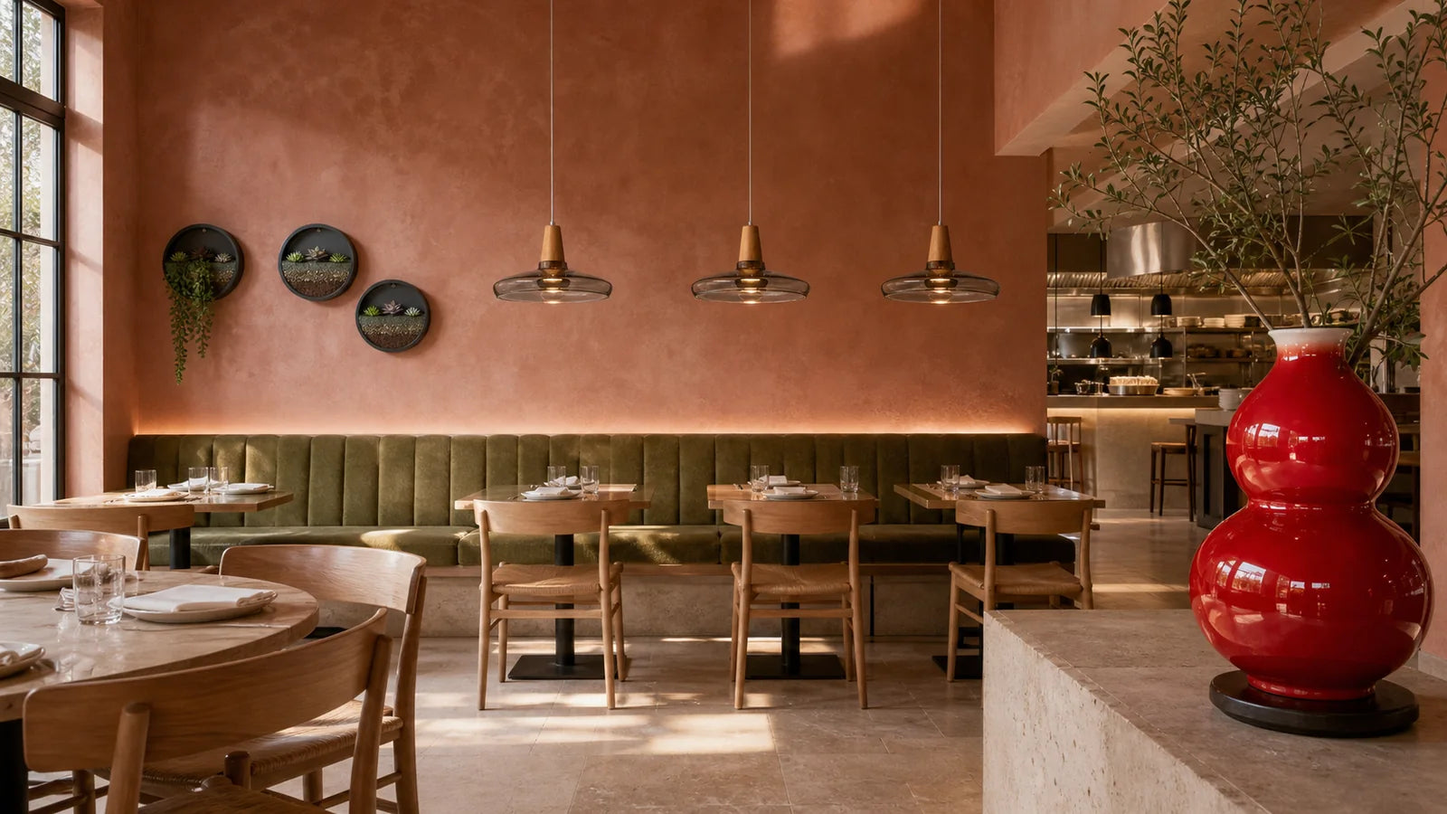
Terracotta is the anchor, and it wants one committed surface with a clear edge — a bar front, a banquette wall, a chimney breast, an arch. Terracotta that seeps across three walls and half the joinery stops being a colour decision and becomes a wall finish.
Burnt clay is depth. Used at the base of the room — lower wall, joinery, banquette backs, a dado — it gives the palette a floor to stand on, and it is what stops an earth room reading as a single hazy wash.
The three things that actually read as cliché
It is worth naming these plainly, because they are specific and each has a specific fix.
One: every warm surface at the same lightness. Covered above. Fix it with value steps and the greyscale test.
Two: no cool anything. A room made only of warm colours has nothing to measure its own warmth against. One cool element — a deep olive banquette, blue-grey ceramic, unbleached stone, real foliage — resets the whole palette and costs almost nothing. Foliage is the easiest version, and it is the point where this palette borrows from the green one.
Three: the decorative shorthand. Grapevine motifs, hanging copper, script lettering, a mural of hills. Individually harmless; together they stop being a colour scheme and start being a theme. If you already have the palette, you do not need the props — and if you need the props, the palette is not doing its job.
The finish does as much as the pigment
Two surfaces at the identical hex value can behave completely differently in the same room, and in an earth palette the difference is usually the finish.
Matte plaster absorbs and diffuses. It gives you the soft, chalky quality people mean when they say "earthy", and it shows every scuff at chair-back height. Specify a wipeable finish or a rail where the chairs land.
Glazed tile and ceramic deliver a specular highlight — the visible reflection of your fixture in the surface. In a warm palette this is often the only real sparkle in the room, and it does more work than a decorative bulb. Place glaze where light will actually strike it.
Unglazed terracotta tile is porous, and in a restaurant that matters more than the look. Sealing regime, staining from oil, cleaning products and slip performance are all supplier questions with documented answers — ask for the test data and check what your local authority requires for a commercial floor before anyone falls in love with a sample.
Timber is the honest bridge, but only if its grain is visible. A heavily filled, uniform finish gives you a warm colour with no texture, which is exactly what a flat earth palette does not need.

Warm light on a warm wall: the one trap
Every instinct says a warm palette wants warm lamps. It is half right, and the half that is wrong is expensive.
A terracotta surface under a warm, amber-heavy source returns more warmth than it received. Do that across a whole room and the result is a space with no colour information left in it: the wall, the timber, the leather and the faces all move the same direction at once, and the room photographs as an orange smear. Guests will not diagnose it. They will just take a photo, dislike it, and not post it.
Three things to do about it:
- Test the lamp before the paint. One fixture zone, one lamp, the sample board on the wall, at your trading dimmer position.
- Keep one surface out of the warm scheme. The cool neighbour is a lighting decision as much as a material one — it gives the eye a reference.
- Watch the faces, not the wall. In a warm room everyone looks slightly flushed. A little is flattering; a lot looks like the heating is broken.
The reasoning behind the Kelvin choice by room type is in our restaurant lighting colour temperature guide — hand that to whoever is specifying lamps, and keep this page for the palette.
Where the clay goes
The anchor surface should be the one that organises the room from the entrance. In practice that is a short list.
The bar or counter front is the strongest option, because it is vertical, it is seen from the door, and it has a natural top and bottom edge. The banquette wall puts the colour behind guests, where it appears in photographs without ever competing with a face — the seating detail behind that is in our banquette seating guide. An arch, alcove or chimney breast is the most architectural version, because the shape gives the colour its own boundary.
Where not to put it: the ceiling, and every wall at once. A terracotta ceiling in a low-lit dining room removes the bounce that keeps faces readable, and a room clad in clay on all four sides has nowhere left to breathe.
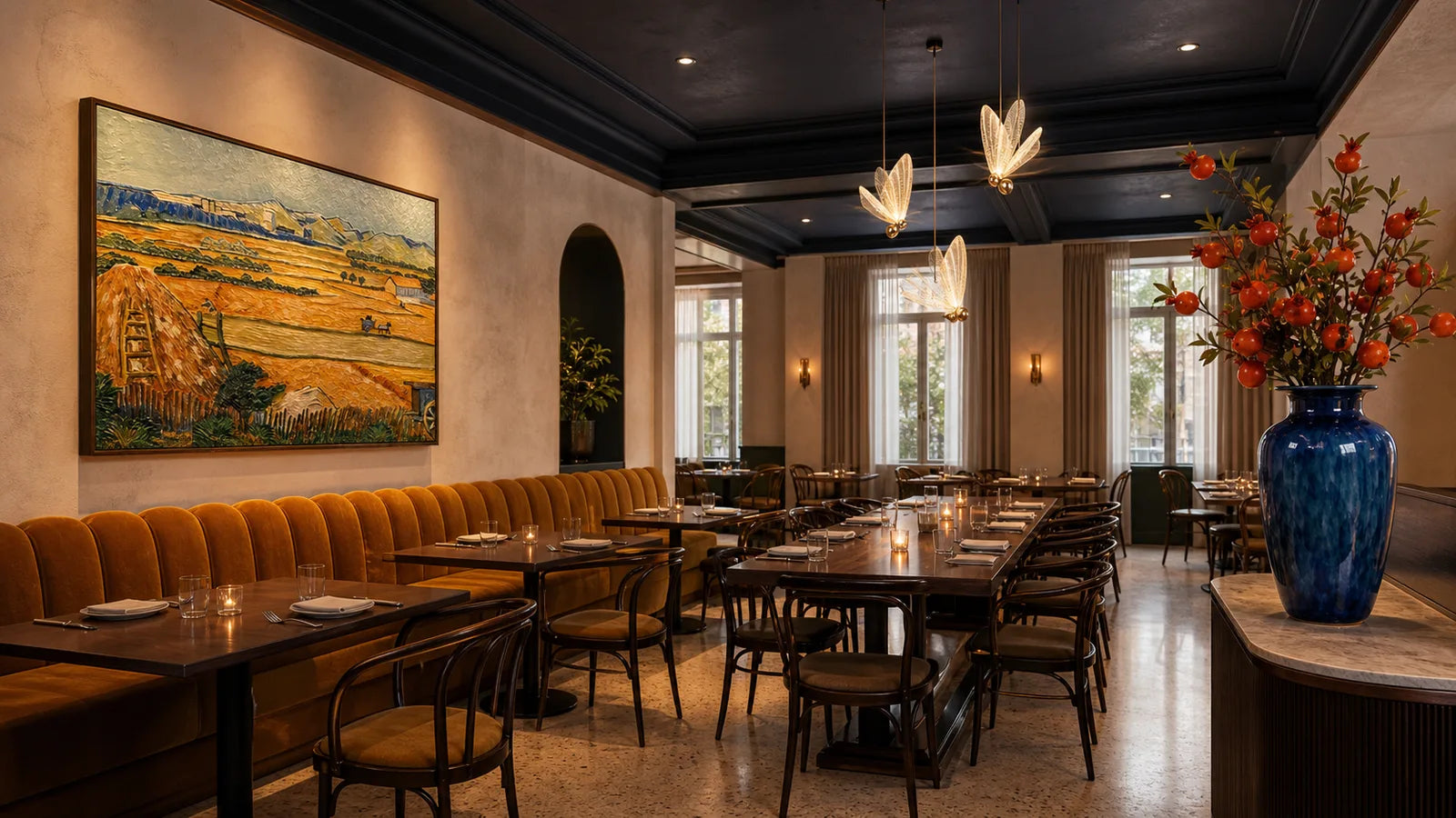
The Terracotta Conservatory is the daylight-and-foliage version of this palette; The Saffron Dining Salon and The Vermilion Grill sit at the saturated end of the range. The whole set is at restaurant looks.
Daylight rooms, bars and tight footprints
The same palette behaves like three different palettes depending on when the room trades.
Daytime cafés and bakeries. Earth tones and daylight are a natural fit, and the risk flips from flat to washed out. Chalky plaster in full daylight can read as unfinished rather than calm. Give the room one properly saturated moment — a glazed tile band, a clay counter front, high-chroma food on display — so the palette has a subject rather than just a mood.
Bars and late service. After dark a terracotta surface drifts towards burnt clay, which means a bar clad in clay is effectively a dark room by nine o'clock. Plan it as one: light the back bar as a task rather than a mood, and check from behind the counter that bottle labels are still legible at the service dimmer setting.
Tight footprints. The value ladder matters more in a small room, not less. Keep the pale band above eye level continuous all the way round — a break in it is exactly where a small clay room stops reading as intimate and starts reading as a corridor. Circulation in that situation is covered in our small restaurant lighting zones guide.
When it goes wrong: a failure table
| What you see | Likely cause to test first | Smallest useful experiment |
|---|---|---|
| The room reads as one brown mass | Warm tones sharing a lightness | Photograph every sample together in greyscale |
| It looks like a themed trattoria | Decorative motifs doing the work the palette should | Remove every motif object for one service |
| The room feels airless | Nothing pale above eye level | Put a pale board on the upper wall for a night and photograph it |
| Everyone looks flushed in photos | Warm ground plus warm lamp, no reference | Introduce one cool material in the sightline |
| The floor stains within weeks | Unsealed porous tile in a service area | Ask the supplier for the sealing regime and test one bay |
| Menus are hard to read | Warm ground reducing contrast on warm menu stock | Test a cool-white or dark menu stock at two tables |
Change one thing at a time and photograph from the same seat each night. A change you cannot see in two photographs was not a change.
What to buy, and in what order
Sample first, buy second. Nothing on this list fixes a palette that failed the greyscale test.
Wall lights. A warm palette lives or dies on whether the upper wall is lit, because that pale plaster band is what returns light to faces. Perimeter light is the highest-leverage fixture in the room. Browse wall lights.
Pendants. They put light on the table and the food without lifting the whole room, which keeps the clay surface from being over-lit into orange. Hang height and shade geometry decide how much reaches the cloth — see our pendant height guide. Browse pendant lights.
A sculptural piece where the glaze can catch light. In a matte earth room, one reflective object supplies the sparkle the palette cannot. Browse soft & sculptural.
Chandeliers earn their place in tall clay rooms, where a pendant over every table would read as visual clutter. Browse chandeliers.
For deep, low, evening-led earth rooms start in Warm & Intimate; for bar and late-service rooms, After Dark. Everything sits under restaurant lighting, and multi-site fit-outs go through trade projects.
Terracotta restaurant interior FAQ
What colours go with terracotta in a restaurant?
Terracotta needs one cool neighbour and one dark line. Deep olive, blue-grey ceramic, unbleached stone or real foliage supply the cool reference; blackened iron or bronze at frames, rails and legs supplies the edge. Keep a pale plaster or travertine band above eye level so the room still returns light to faces.
Is terracotta a good colour for a restaurant?
It works well when it is treated as one anchor surface with a clear architectural edge, and badly when it spreads across every wall. The colour is forgiving; the value range is not. Spread your tones widely in lightness, keep ochre small, and check the whole palette in a greyscale photograph before ordering.
How do I stop an earth-tone restaurant looking dated?
Dated usually means two things: every warm surface at the same lightness, and decorative motifs standing in for a palette. Fix the first with real value steps and one dark line at the edges. Fix the second by removing the props — if the colours are working, the room does not need them.
What lighting suits a terracotta interior?
Warm light on a warm wall can leave a room with no colour information at all. Test one lamp in one fixture zone against a sample board at your trading dimmer position, keep one surface deliberately outside the warm scheme, and judge the result on faces rather than on the wall.
Is terracotta floor tile practical in a restaurant?
Unglazed terracotta is porous, so sealing, oil staining, cleaning chemicals and slip performance are all real operating questions. Ask the supplier for the documented test data and sealing regime, and confirm what your local authority requires of a commercial floor, before anyone commits to a sample.
Further reading: the same method on other colour families is in green restaurant interiors and blue restaurant interiors. If your burnt clay is deep enough to read black after dark, the rules change — start with dark restaurant interiors that feel intimate, not gloomy. The Kelvin half of every colour decision is in our restaurant lighting colour temperature guide.
Keep reading

guest-experience
Restaurant Restroom Cleaning Checklist and Inspection Log
Use this restaurant restroom cleaning checklist for opening, service inspections, supplies, fixtures, floors, waste, incidents, and closing records.

dining-room-operations
Restaurant Dining Room Cleaning Checklist: Turn to Close
Use this restaurant dining room cleaning checklist for table turns, high-touch points, spills, service stations, floors, opening, and close.

food-safety
Restaurant Kitchen Cleaning Checklist for Every Shift
Use this restaurant kitchen cleaning checklist to control opening, between-task, four-hour, closing, and weekly work without vague assignments.