
Dark Restaurant Interiors That Feel Intimate, Not Gloomy
Dark dining rooms fail on contrast, not brightness. Where light must land, which dark undertone to pick, and the pale ten per cent that saves the room.

By the Resto Glow Studio team · Drafted 5 August 2026
Two restaurants can measure almost the same at the table and feel nothing alike. One reads as intimate — you lean in, you stay, you order another round. The other reads as gloomy, and guests reach for a phone torch to find the anchovies on a menu.
The difference is almost never the overall level. It is where the light lands, what the surfaces give back, and whether faces have anything to be seen against. Dark rooms are the hardest palette in hospitality to get right, and they fail in a way that is very specific and entirely fixable.
This is the third in a set: blue goes cold, green goes drab, terracotta goes flat. Dark goes gloomy — and gloomy is a contrast problem wearing a brightness costume.
The short version
A dark room does not need more light. It needs the light it has aimed at four things, and it needs about ten per cent of its surface area to be pale enough to hand that light back.
- Faces first — everything else is negotiable
- Then the tabletop — food, menu, hands
- Then the perimeter — a lit wall is what stops a room feeling like a lid came down
- Then the route — continuous, low, no step left in shadow

Gloomy is a contrast problem, not a brightness problem
Turn the dimmer up in a gloomy room and it usually gets worse. The room becomes visibly dim rather than atmospherically dark, the surfaces that were hiding become plainly drab, and you have spent your entire mood budget on nothing.
What guests are actually reacting to is that nothing in their field of view is legible. A face across the table is roughly the same brightness as the wall behind it. The plate is the same brightness as the tabletop. The eye has nothing to lock onto, so the room reads as murk rather than as a lit scene.
Intimate rooms are not evenly dim. They are unevenly dark: a small number of bright, well-placed things surrounded by a great deal of very dark nothing. That is the whole trick, and it explains why a candlelit room with a white cloth reads beautifully at a level that would make a grey room feel like a car park.
So the design question is not "how bright should it be?" It is "what are the four brightest things a seated guest can see, and are they the right four?"
Where the light has to land
Rank the planes before you buy anything, because in a dark room every plane you light is one you cannot afford to light somewhere else.
The seated face plane is the whole ballgame. It is the plane that decides whether guests read a room as flattering or as a cave, and it is the one operators most often light indirectly and hope for the best.
The tabletop comes second: food, menu, hands. It is also the plane most easily solved, because a pendant or a small lamp puts light exactly there without lifting the room.
The perimeter is the most under-used fix in hospitality. Lighting the upper wall raises the perceived brightness of the room a long way while raising the level at the tables barely at all — which is precisely the trade you want. A dark room with an unlit perimeter feels like a lid came down.
The route is the safety plane and the one an inspector walks. Continuous, low, with nothing that hides a step or a level change.
The ceiling you can simply let go. Nothing you own is up there, and light thrown at a dark ceiling comes back as almost nothing.
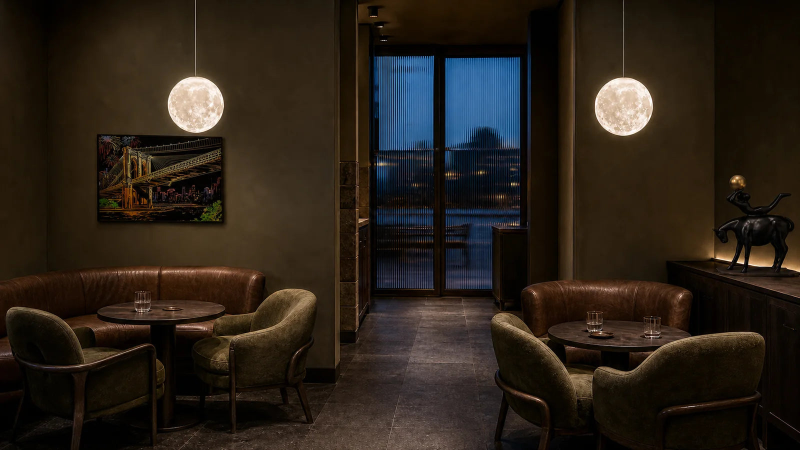
The tabletop is doing half the lighting
This is the part that changes how operators think about dark rooms, and it comes with actual numbers.
In a December 2018 study published in the Illuminating Engineering Society's LD+A magazine, Brett Andersen measured how much light reached guests' faces from the table surface itself. A black tablecloth bounced 0.2 foot-candles up towards faces. A white cloth, in the same conditions, bounced 7.1 — about thirty-five times more. White plates on a black table came in at 2.2 fc, roughly eleven times the black cloth, for the price of crockery.
For scale, the same article puts a candle at roughly 0.5 to 1.0 fc on the plate and 0.3 to 0.5 fc on a face, and identifies readings below about 0.4 fc as a field-survey "danger zone" in which diners could not clearly see their food. That threshold is the author's finding, not an adopted standard — but it is a useful alarm bell when guests start using their phones as torches.
The operational reading of those figures is blunt: in a dark room, your table surface is a light fixture. A dark-timber, dark-linen room is not just dark — it is actively taking back the light you paid to install. Change the cloth and you have changed the lighting scheme without touching a single fitting.

The cheapest experiments in this entire article follow from that chart, and none of them need an electrician: run one section on pale runners for a week; switch two tables to pale crockery and photograph them side by side with the dark ones; put a pale, matte tray or a stone board under the shared dishes and see what it does to the faces above it. Do it in the same seat, at the same dimmer setting, and photograph everything.
Dark is not one colour
Every dark ground has an undertone, and the undertone decides what happens to a face in front of it. This is the decision people skip because, on a paint card in a showroom, all five look like the same expensive black.
Bitter chocolate — a red-warm dark — is the safest ground in a dining room, because its warmth keeps skin looking alive rather than corpse-like. Oxblood is the most flattering of all and the least forgiving of dust and fingerprints. Soot, a true neutral, gives nothing back at all; every lumen has to be delivered by a fixture. Midnight ink is handsome in daylight and the coldest on faces after dark, which is exactly the trap the blue post covers in more detail. Deep olive is quiet and forgiving, but it needs a warm neighbour or the room tips green.

The ten per cent that saves the room
Somewhere in a dark room there has to be a small amount of genuinely pale, reflective material. Not a lot. Around a tenth of the visible surface is enough, and it is the difference between a room that reads as designed and one that reads as unlit.
It has four practical homes:
- Table — cloth, runner, crockery, a stone or marble board
- Perimeter — a plaster band or pale artwork above the banquette, catching wall light
- Metal — brass and bronze, which do not add measurable light but give the eye something to catch
- Glass and glaze — the specular highlight of your own fixtures, reflected
Cut those and the same fixtures light a room that suddenly reads as gloomy. It is the most common single cause of a dark scheme going wrong, and it usually happens by accident — a designer swaps a cream cloth for charcoal late in the process and nobody re-runs the room.
Sheen is the other half of it. Velvet drinks light and gives back almost nothing; a matte lacquer joinery front does the same. Something in the scheme needs a raking relationship with a light source — a textured plaster, a fluted timber, a hammered metal — so that light skims across it and reveals a surface rather than disappearing into one. Our layering restaurant lighting guide covers how the layers interact through a service.
The floor you cannot design away
Mood stops at the point where a code starts, and dark rooms run into that boundary in four predictable places.
Restrooms are the most common failure, because designers pull the level down to match the dining room's mood and it is precisely the wrong room to do it in. Storage, walk-ins and warewash areas have their own requirements and are usually forgotten entirely. Exit signs and exit routes are covered by OSHA 1910.37, which sets out requirements for illuminated exit signs and adequately lit exit routes. And any area during cleaning is a separate condition from the same area during service — most rooms clean in service lighting out of pure habit.
We are not going to restate the numbers here: the sourced zone-by-zone chart, with the code sections behind each figure, is in our restaurant lighting foot candle chart. Confirm the edition your own jurisdiction has adopted before treating any published figure as your requirement.
The design consequence is simple. Plan the dark room and the compliant room as two separate scenes on the same controls, not as one compromise that satisfies neither.
When it goes wrong: a failure table
| What you see | Likely cause to test first | Smallest useful experiment |
|---|---|---|
| Guests use phone torches on the menu | Nothing lighting the tabletop plane | Trial pale runners and a table lamp on four covers |
| The room feels like a lid came down | Unlit perimeter | Light one upper wall section for a service and photograph it |
| Faces look grey or sallow | Cool-undertoned dark ground, or no bounce | Put a warm-white runner on two tables and compare from the same seat |
| The room is dim but not atmospheric | Even dimness — no bright focal points | Raise one focal layer, lower ambient, and re-photograph |
| Staff misjudge steps and thresholds | Route lighting discontinuous | Walk the route in service light and mark every dark gap |
| It photographs badly for guests | Faces darker than the background behind them | Add table-level light and re-shoot from the guest seat |
Run one at a time. In a dark room especially, changing three things at once tells you only that the room is different.
Small dark rooms, and dark bars
Small dark rooms are where this palette either sings or suffocates. A dark surface hides the boundary between a wall and a route, so the room's edges become guesswork. Keep the route legible, keep the perimeter lit, and give guests a clear read on where the room ends — our small restaurant lighting zones guide covers the circulation half of that problem.
Dark bars are the natural home of this palette and have one extra constraint: bartenders are doing precision work against a dark ground. A pour is a task, and the back bar needs task light regardless of how the front of the room reads. Bottles against a dark back bar are one of the best decorative effects in hospitality — and they need to be lit as objects, not as ambience. The detail is in our bar lighting design guide.
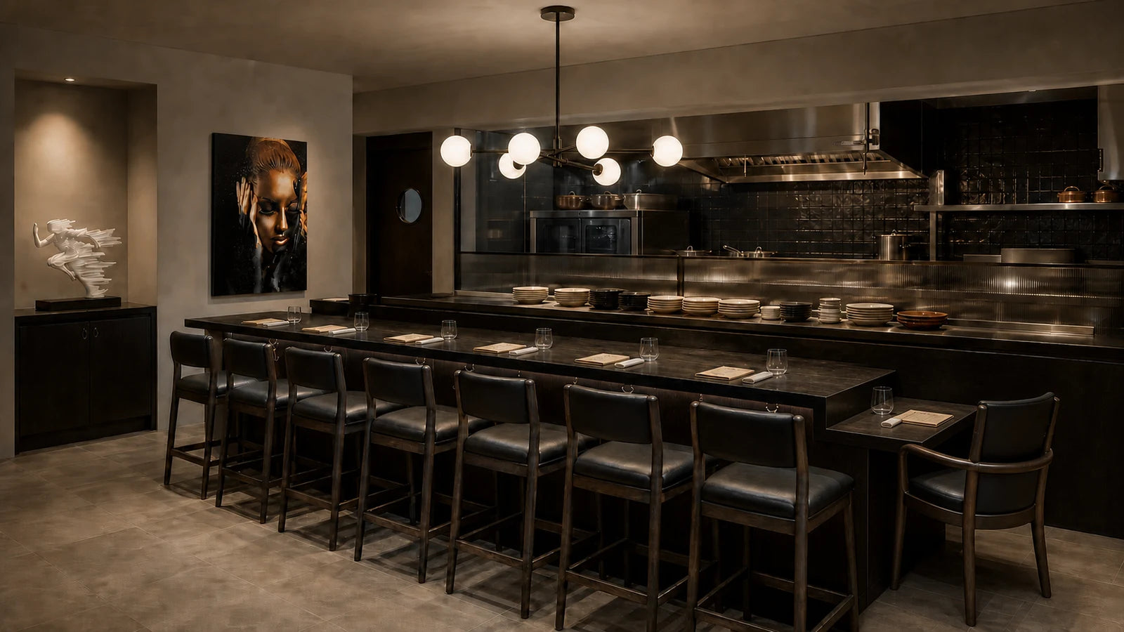
Both rooms are worth walking as references — The Nightjar Lounge, The Onyx Chef's Counter and The Midnight Bar sit at different points on the same dark spectrum, and the full set is at restaurant looks.
What to buy, and in what order
Buy only after you can name the plane that is failing.
Wall lights first, and it is not close. The perimeter is the single highest-leverage fixture in a dark room, because lighting the upper wall raises perceived brightness far more than it raises the level at the tables. Browse wall lights.
Pendants for the table plane. They deliver light to the tabletop without touching the room around it, which is exactly the shape of the problem. Hang height and shade geometry decide how much lands on the cloth — see our pendant height guide. Browse pendant lights.
Rechargeable table lamps for the face plane. A small pool at the cover lifts faces and menus without lifting anything else, and it needs no installation. Check runtime at the service setting, glare from every seat, and build a charging routine before you buy a fleet. Browse table lamps.
Decorative bulbs are sparkle, not output. In a dark room they are seen rather than seen-by. Spec them where you want a bright point in the field of view and never where a plane has to be lit.
For late-service rooms and bars start in After Dark; for low, warm dining rooms, Warm & Intimate. Everything sits under restaurant lighting, and multi-site fit-outs go through trade projects.
Dark restaurant interior FAQ
How do you make a dark restaurant feel warm rather than gloomy?
Aim the light instead of adding it. Prioritise faces, then the tabletop, then the perimeter, then the route, and let the ceiling go dark. Keep about a tenth of the visible surface pale and reflective — cloth, crockery, a plaster band, brass — so the room hands light back. Even dimness reads as gloom; uneven darkness reads as intimacy.
What is the best dark colour for a restaurant interior?
Choose by undertone, not by name. Red-warm darks such as bitter chocolate and oxblood keep skin looking alive; oxblood is the most flattering and the least forgiving of dust. True neutrals give nothing back, so every lumen must be delivered. Blue-cool darks look handsome in daylight and coldest on faces after dark.
Do dark walls make a restaurant look smaller?
They make its boundaries harder to read, which is not quite the same thing. A dark surface hides the join between a wall and a route, so guests lose their sense of where the room ends. Lighting the perimeter and keeping the circulation route continuously legible does more for perceived size than lightening the paint.
How bright should a dark restaurant be?
There is no single defensible number for atmosphere, and we will not publish one. What is measurable is that back-of-house zones, restrooms and egress carry real requirements — those are in our sourced foot-candle chart. For the dining room, measure your own tables, test menu legibility with real guests, and document the scene you approve.
Does a white tablecloth really change the lighting?
Substantially. In an LD+A field study for the Illuminating Engineering Society, a white cloth bounced about thirty-five times more light onto guests' faces than a black one under the same conditions, and white plates on a black table gave roughly eleven times the black cloth. Changing table linen is the cheapest lighting change most dark rooms can make.
Further reading: the sourced zone-by-zone numbers are in our restaurant lighting foot candle chart, and the Kelvin half of the decision is in the restaurant lighting colour temperature guide. The same method on lighter palettes is in green, terracotta and blue restaurant interiors. Primary source for the surface figures on this page: Brett Andersen's December 2018 restaurant-lighting study for the Illuminating Engineering Society.
Keep reading

guest-experience
Restaurant Restroom Cleaning Checklist and Inspection Log
Use this restaurant restroom cleaning checklist for opening, service inspections, supplies, fixtures, floors, waste, incidents, and closing records.

dining-room-operations
Restaurant Dining Room Cleaning Checklist: Turn to Close
Use this restaurant dining room cleaning checklist for table turns, high-touch points, spills, service stations, floors, opening, and close.

food-safety
Restaurant Kitchen Cleaning Checklist for Every Shift
Use this restaurant kitchen cleaning checklist to control opening, between-task, four-hour, closing, and weekly work without vague assignments.