
Green Restaurant Interiors: Sage to Forest, Not Drab
Sage, lichen, eucalyptus, bottle, forest: pick a restaurant green by how it behaves at night, pair it with timber and brass, and treat plants as a material.

By the Resto Glow Studio team · Drafted 5 August 2026
Green is the easiest colour to fall in love with on a moodboard and the hardest to keep once the lamps go on. Its range is enormous — sage reads like a linen napkin, forest reads like a private club — and the room you end up with depends less on which green you choose than on what sits beside it and what you light it with.
This is the palette-depth companion to our green restaurant interior design guide, which covers the whole-room decision. Here we stay with the colour: five greens and how each behaves after dark, what warm lamps do to them, and why plants belong in the material schedule rather than the decor budget.
We ran the same method on blue in how to use blue in a restaurant interior without making it feel cold. Green fails differently. Blue goes cold; green goes drab.
The short version
Give the green one committed surface, one warm bridge, and one surface pale enough to bounce light back at faces. Decide the lamp colour before the paint colour: warm light moves a green further than any second opinion will.
- Anchor — one green surface with a clear architectural edge
- Bridge — timber, in enough area to read as warmth rather than trim
- Breathing surface — plaster, cloth or stone above eye level
- Sparkle — aged brass, in an amount you could count on one hand

Pick the green by how it behaves at night, not by its name
Paint names are marketing. What you need to know is where a green's undertone sits, how much light it gives back, and what it does at your trading dimmer position.
Sage is a grey-yellow green, pale enough to be a whole-room field colour. It is the most forgiving choice and the likeliest to disappoint — in a dim room it drifts towards chalk and reads as unfinished. Sage needs daylight, or a properly lit perimeter.
Lichen is a yellow-green, and the green warm lamps flatter most: under a warm source it deepens rather than dulls. Its risk is the opposite of sage's. Push the lamp warm enough and it stops reading as green at all.
Eucalyptus is the blue-green mid-tone designers reach for because it photographs beautifully. It also reads cool: left alone with white plaster and pale stone it produces a handsome, faintly clinical room. It needs timber, in quantity.
Bottle is deep, faintly blue, and made for joinery — banquette walls, bar fronts, a panelled dado. It absorbs light rather than returning it, so it changes your lighting budget, not just the paint order.
Forest stops being a colour after dark and becomes a dark ground. If you are specifying forest for a room that trades at night, you are designing a dark room and the rules change — see dark restaurant interiors that feel intimate, not gloomy.
The undertone test that takes ten minutes
Lay your candidate boards flat on a table in the room and hold plain white printer paper against each in turn. The paper is your neutral. Against it, yellow-greens look warm and slightly dirty; blue-greens look clean and slightly cold. You cannot see this from one board, which is why single-board decisions go wrong.
Then repeat beside a plated dish from your own menu. A green that turns your greens grey, or your sauces brown, has told you something no moodboard will.
Give the green one surface, and give it an edge
Green fails in restaurants far more often from distribution than from shade. Three green walls, a green banquette, green glassware and a green menu produce a themed room. One green surface with a clean architectural boundary produces a designed one.
Choose the surface by what it has to do. The banquette wall puts green into every photograph without competing with a face. The bar or counter front anchors the room from the door. A dado or panelled lower wall keeps the upper wall pale, which is where you need the bounce. Joinery is the lowest-risk commitment, because it arrives with its own edges.
What matters is that the green stops somewhere deliberate. A colour that fades out at an arbitrary corner reads as an unfinished decorating job; one that stops at a rail, a reveal or a change of material reads as a decision. Keep the upper wall and ceiling out of it — above eye level is where a room returns light to faces, and a green ceiling in a low-lit dining room quietly takes that away.
Plants are a material, not a decoration
The commonest green-room mistake is treating paint as the design and plants as styling. It is the wrong way round. Foliage is the only green in the room with texture, movement and a different value in every leaf — and the only one that dies if you specify it badly.
Treat planting like any other material: it has weight, a maintenance schedule, a service life and a failure mode. A dining room asks foliage to do three jobs. Screening divides space without building a wall, so it needs density, consistent height, and the resilience to be brushed past forty times a night. Softening a hard corner is a silhouette job — the plant is seen against a lit surface, so its outline matters more than its leaf colour. Table-level texture is the most demanding, because it competes for the surface your covers need and gets handled every service.
Three constraints decide whether any of that survives. Dining light and plant light are different problems, so living foliage sits near daylight or gets its own fixture. Every planter needs a watering and drainage answer first, because a planter that cannot be watered without moving it will not be watered. And someone specific owns the schedule, in writing, on the same rota as the glassware.
Species and maintenance intervals are their own subject, and they are in our low-maintenance restaurant plants guide. What matters here is that foliage adds the one green value you cannot buy in a tin.
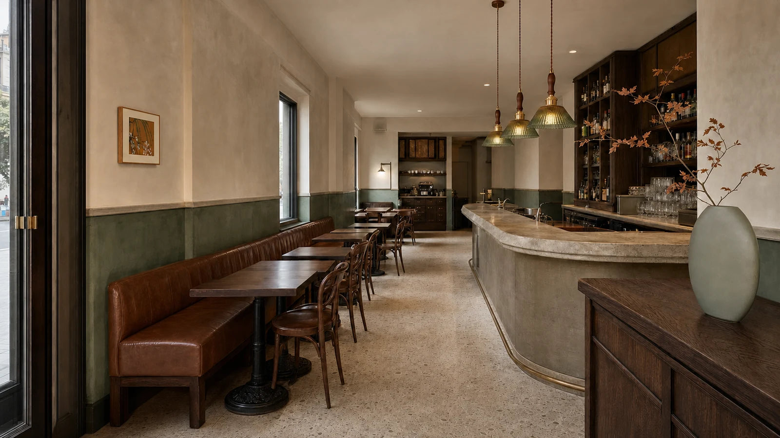
Timber, brass and stone: the neighbours that decide it
A green room's temperature is set almost entirely by what sits next to the green. Blue needs warmth to stop feeling cold; green needs warmth to stop feeling institutional. Different failure, different fix.
Timber is the fix — not a timber table edge and a menu board, but enough that guests read a warm room with green in it. White oak is the safe answer, its pale grain lifting a mid-green without competing. Walnut is the beautiful, risky one: with a deep green it makes a handsome room that will close in on you unless something pale sits above eye level.
Brass is the accent, and the discipline is arithmetic. Two brass moments in a sightline read as jewellery. Ten read as a hardware display. Pick the two that catch the eye from the door and stop.
The forgotten surface is the pale one. Limestone, travertine, linen or plain plaster above the green puts light back on faces, and it costs nothing at design stage. Choose warm-white over optic-white — an optic-white cloth beside a mid-green makes the green look drained rather than clean.

Green is the colour warm lamps punish most
Every colour decision in a restaurant is really a lighting decision, and green is where that shows most. Warm, amber-heavy light carries relatively little short-wavelength energy, so it has little to give a green surface back. The surface returns what it is offered, and what it is offered is amber. The same tin reads sage at noon and khaki at nine — which is not a flaw. A lichen green that deepens to olive may be exactly the room you wanted. The mistake is discovering it after the second coat.
- Choose the lamp colour before the paint colour. Repainting a sample board is cheap; relamping a room is not.
- Do not mix lamp colours in one sightline unless the contrast is deliberate. A green wall shows a mismatch a cream wall would have hidden.
- Ask for rendering data, not just the average. Ra is one averaged figure; the fuller Illuminating Engineering Society measures — TM-30's Rf and Rg — describe fidelity and saturation separately. If your room depends on foliage looking alive, that is worth a question to the supplier.
The Kelvin side is a subject of its own and we are not going to restate it: our restaurant lighting colour temperature guide is the explainer to hand to whoever specifies lamps.

Check it at the dimmer position you actually trade at
Not at full output, and not with the house lights up. Set the room to your eight-o'clock Friday scene, then check five things in order: a face across the table, a plated dish, the menu, the green surface, and the brass. If the first four are right and the green looks slightly duller than you hoped, you have a good room. If the green is perfect and faces are grey, you have a paint sample, not a restaurant.
Photograph each state from the same seat with white balance locked. Phone auto white balance quietly corrects the exact shift you are trying to see.
When it goes wrong: a failure table
| What you see | Likely cause to test first | Smallest useful experiment |
|---|---|---|
| The room reads institutional | Blue-green paired only with cool neutrals | Lay a large oak or walnut board against the wall for one service |
| The green looks grey and lifeless | Poor rendering, or an optic-white neighbour | Swap white linen for warm-white on two tables |
| The green has turned khaki | Lamp colour too warm for a yellow-green | Test one fixture zone at a cooler lamp before repainting |
| The room feels themed | Green spread across too many elements | Remove every green object except the anchor surface for a night |
| Plants look tired within a month | Dining light mistaken for plant light | Move one specimen to the daylight side and compare |
Run these one at a time. Changing three variables in one shift teaches you nothing.
Small rooms, bars and breakfast counters
Small rooms. Deep green in a tight footprint photographs magnificently and makes circulation harder to read, because a dark surface hides the boundary between a wall and a route. Keep the green below eye level, the upper wall pale, and the path from door to far table legible without anyone hunting for it — our small restaurant lighting zones guide covers that half.
Bars. Bottle and forest behind a back bar are among the best backdrops in the business, because bottles read as jewellery against them. The trade-off: bartenders now work against a dark ground and need their own task light. A pour is a task, not a mood.
Breakfast and bakery counters. A pale green room trading in daylight flips the calculus: the green competes with daylight, and the risk is washed out rather than drab. Pale greens want a strong secondary — timber, a patterned surface, or high-chroma food on display.
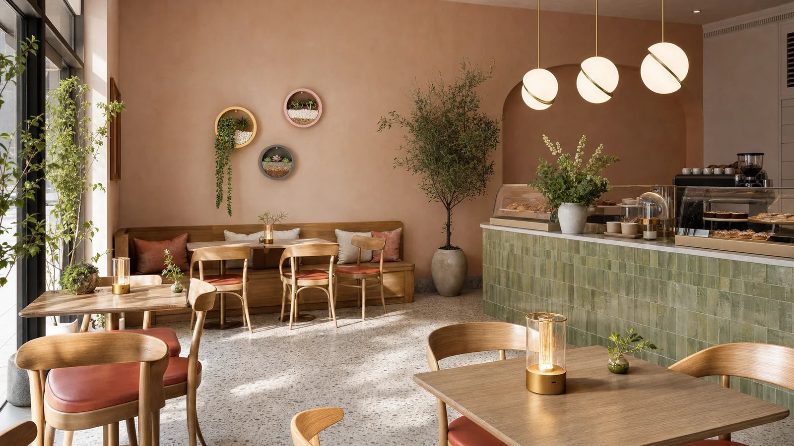
Both ends of the range sit in one place: The Juniper Brasserie for the deep timber-led version, The Pistachio Breakfast Bar for the pale daytime one. The full set is at restaurant looks.
What to buy, and in what order
Nothing here matters until a sample board has survived a real service in your room.
Wall lights first. The perimeter is the highest-leverage fixture in a green room: lighting the upper wall stops the scheme reading heavy without lifting the level at the tables. Browse wall lights.
Pendants second. They light the table and the food without lifting the room — precisely the shape of the problem in a deep green dining room. Hang height and shade geometry decide how much lands on the cloth; our pendant height guide has the trade-off. Browse pendant lights.
Table lamps where covers need help. A small pool at the cover lifts menus and faces without touching the room. Check runtime at the service setting and glare from every seat before buying a fleet. Browse table lamps.
For a deep timber-led room start in Warm & Intimate; for a pale daytime one, Bright & Social. Everything sits under restaurant lighting, and whole-site fit-outs go through trade projects.
Green restaurant interior FAQ
What is the best green for a restaurant interior?
There is no best green, only a best green for your light. Yellow-greens such as lichen deepen attractively under warm lamps; blue-greens such as eucalyptus stay cleaner but need timber to feel hospitable; pale sage suits daylight rooms. Choose the lamp colour first, then test two candidates on large boards at your trading dimmer position.
Does green make a restaurant look smaller?
Deep greens absorb light rather than returning it, which makes boundaries harder to read and a tight room feel tighter. The fix is usually not a paler green but a paler surface above eye level, plus perimeter light on the upper wall — that bounce is what makes a small room legible.
Should I use real or artificial plants in a green restaurant?
Decide by light and labour, not preference. Living foliage needs far more light than a dimmed dining scene gives, so it belongs near daylight or under its own fixture, with a named person on a written rota. Where neither is possible, good artificial greenery is the honest choice — and still needs cleaning.
What colour temperature works best with green walls?
Warmer lamps pull green towards olive and khaki; cooler lamps keep it green but cool the faces in the room. Most green dining rooms land in the warm-to-neutral middle, but the reliable answer comes from testing a painted board under the actual lamp at your service setting.
What goes with dark green in a restaurant?
Timber in quantity, one pale surface above eye level, and a little aged brass. Walnut gives the richest result and the darkest room; white oak is the safer bridge. Limestone, travertine or warm-white linen supplies the bounce that keeps faces readable. Blackened steel works as punctuation, but outlining every edge turns the room graphic.
Further reading: the whole-room version is our green restaurant interior design guide; the same method on other colour families is in blue restaurant interiors and terracotta and earth-tone restaurant interiors; and if your green reads black after dark, start with dark restaurant interiors that feel intimate, not gloomy.
Keep reading

guest-experience
Restaurant Restroom Cleaning Checklist and Inspection Log
Use this restaurant restroom cleaning checklist for opening, service inspections, supplies, fixtures, floors, waste, incidents, and closing records.

dining-room-operations
Restaurant Dining Room Cleaning Checklist: Turn to Close
Use this restaurant dining room cleaning checklist for table turns, high-touch points, spills, service stations, floors, opening, and close.

food-safety
Restaurant Kitchen Cleaning Checklist for Every Shift
Use this restaurant kitchen cleaning checklist to control opening, between-task, four-hour, closing, and weekly work without vague assignments.