

The most common wall-art mistake in a restaurant is not the colour. It is scale. A piece is chosen from a close product photograph, centred over the nearest two-top, and hung at standing eye level. When the room fills, it floats above a six-metre banquette, disappears behind pendant glare, or sits close enough to a guest’s head that staff quietly move the table.
The fix costs paper and tape: size the art to a fixed visual anchor, compare two noticeably different outer dimensions on the real wall, and set the lower edge from seated and service views before drilling.
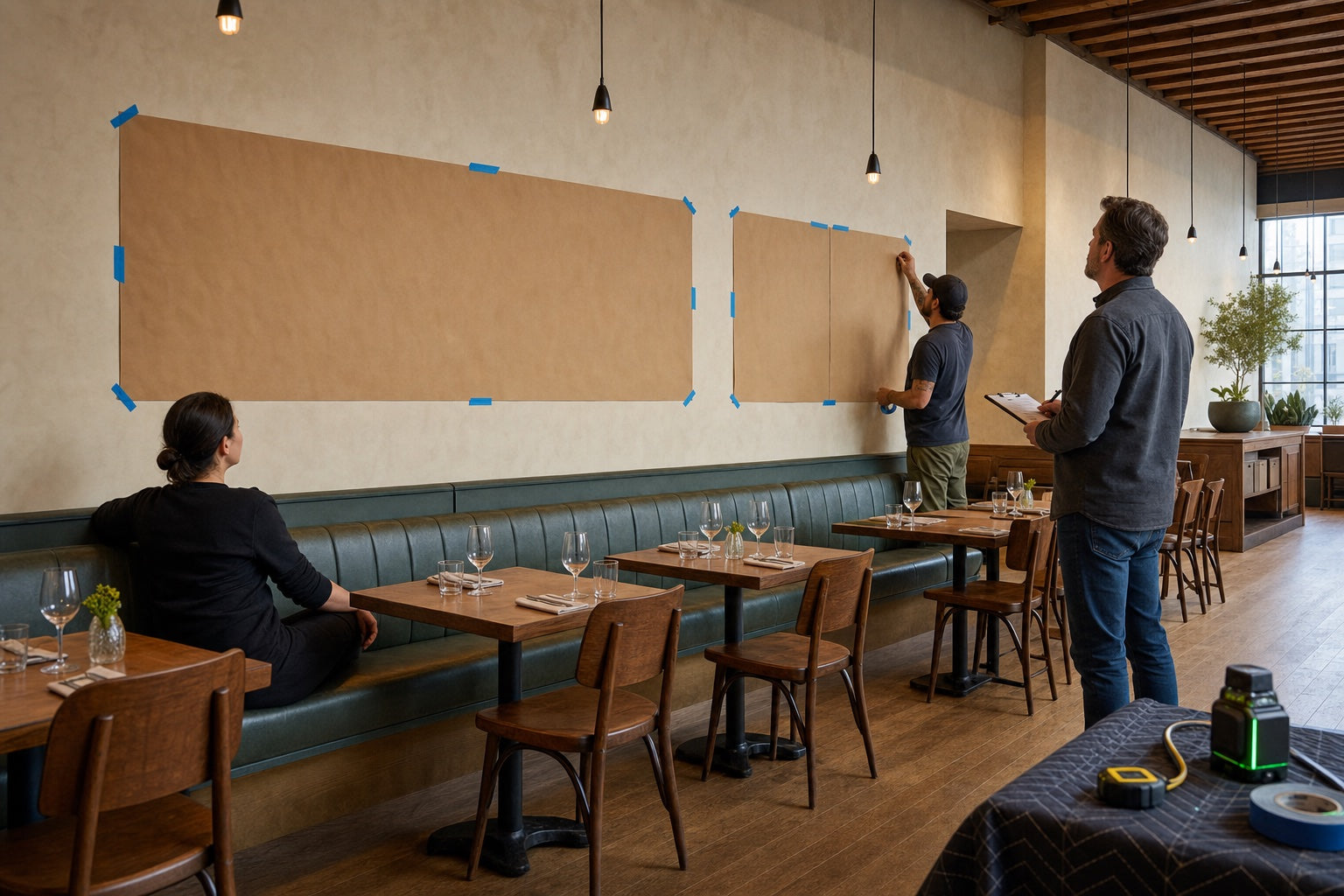
Decide what the artwork belongs to
Do not begin with the empty wall. Begin with the fixed element the art must complete:
- the full banquette run;
- one built-in booth;
- a host console or waiting bench;
- the end of a bar;
- an architectural bay between columns or wall returns;
- a private-dining sideboard or fixed table.
Movable two-tops are weak anchors. They shift for parties, prams, cleaning, and accessibility. If the art is centred over one loose table, the composition can look wrong by the second service.
Draw the anchor as one rectangle. Add doors, controls, sconces, vents, chair contact, and the service route. The remaining area is the usable art zone—not the whole wall.
The companion restaurant wall-decor guide filters that zone for route, contact, exposure, and upkeep before you choose framed work, metal, textile, paint, or another format.
Compare two outer widths, not two catalogue sizes
For one artwork or a tight group above fixed furniture, a useful first exercise is to test an outer composition around 50–75% of the anchor width. That is an editorial mock-up envelope, not a rule. A pale line drawing may need more physical width; a dark or illuminated object may dominate at less.
Make two paper options that are noticeably different. If one is 120 cm wide and the other is 125 cm, the comparison will not teach you much. Test a calm smaller option and a confident larger option.
Use the outside frame or group dimensions, including gaps. Do not mock only the printed image. A wide mat, thick frame, shadow gap, or metal projection changes the visual weight and installed size.
Leave both options on the wall through at least one representative service state. The larger piece that looks dramatic in an empty morning room may become too loud when every seat, glass, menu, and pendant appears.
One large piece or a group?
A single large work makes one calm decision. It suits a room that already has patterned tile, open shelves, pendant rhythm, expressive upholstery, or many small objects.
A group can create a long horizontal rhythm, use replaceable standard frames, and support rotating local work. It fails when the gaps drift or every image, frame, and colour asks for attention.
For a group:
- decide the outer rectangle first;
- keep gaps consistent;
- align at least one edge or centre line;
- give mixed frames one other rule, such as palette, subject, repeated dimension, or a clean outer boundary;
- hang from a measured datum, not one frame at a time by eye.
Use the framed-prints guide for glazing, material, layout, and fixing questions. Use the metal wall-art guide when open relief, projection, finish, or grazing shadow matters more than printed colour.
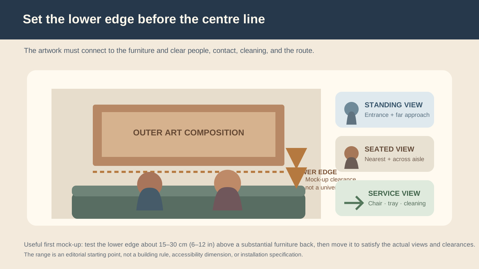
Set the lower edge before the centre
“Hang it at eye level” is incomplete restaurant advice. Whose eye, and from which seat?
The lower edge has to negotiate the banquette back, seated heads, shoulders, chair movement, cleaning, and visual connection. Put the real furniture in place. Seat someone at the nearest and lowest position. Tape the paper mock-up so it feels attached to the furniture without resting visually on the guest.
A first mock-up 15–30 cm (6–12 in) above a substantial furniture back can be useful. It is not a universal answer or accessibility dimension. Deep backs, loose cushions, low ceilings, very tall frames, chair contact, picture lights, and local protection details can move the correct edge.
Then stand at the entrance. If the art now feels too low from the far approach, do not immediately lift it. Check whether the composition is too small, the wall anchor is wrong, or the furniture and art need a different relationship.
Align to architecture when furniture moves
Use a stable datum:
- centre of the full banquette run;
- centre of a wall bay;
- edge of a column or wall return;
- midpoint between fixed sconces;
- centre or edge of a host console;
- a continuous ledge or panel joint.
Do not automatically centre to the room. An asymmetric position can be correct when it balances a doorway, plant, light, or service opening. Mock the complete elevation, including those elements, before judging the art in isolation.
Visual weight changes the physical answer
Two pieces with identical dimensions can behave differently.
- Pale, low-contrast paper may recede and need more width.
- A black metal silhouette can read strongly while leaving wall visible.
- A heavy dark frame can make a modest print feel larger.
- Glazing can create a bright reflected rectangle.
- Textile absorbs light and may appear quieter than its area suggests.
- An illuminated object can become the dominant feature even when physically small.
This is why the 50–75% envelope is only the beginning. Tape the real outside dimensions and, where possible, add a printout or colour block that approximates the final visual weight.
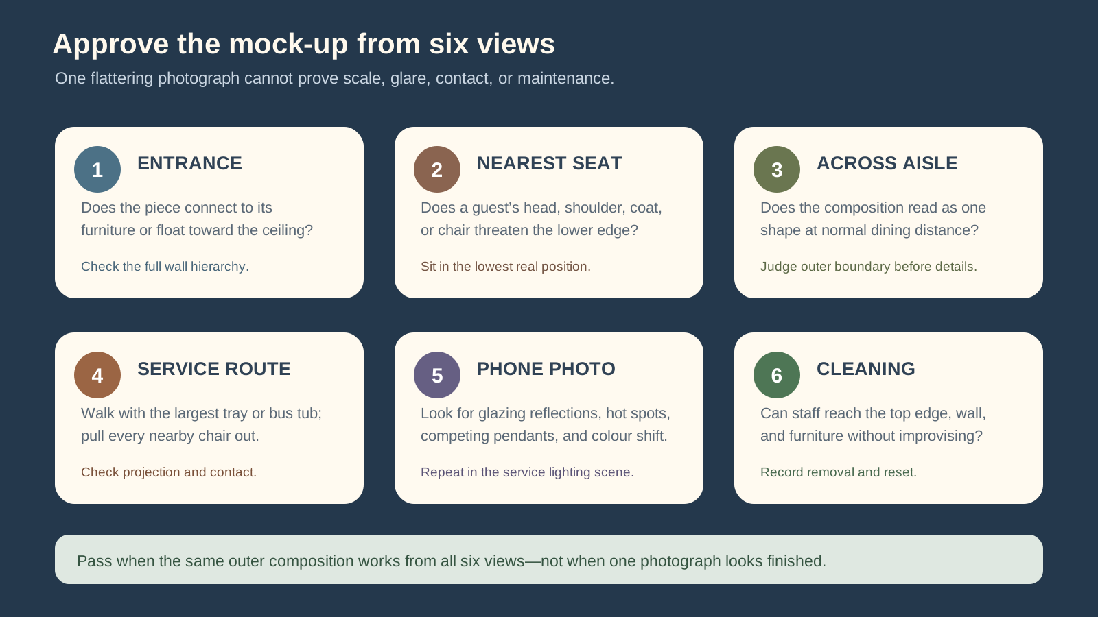
Audit six views
The artwork must work for people who are standing, seated, serving, photographing, and cleaning.
- Entrance: does it connect to its anchor or float toward the ceiling?
- Nearest seat: can a head, shoulder, coat, or chair contact the lower edge?
- Across the aisle: does the group read as one composition at dining distance?
- Service route: can the largest tray or bus tub pass after every nearby chair is pulled out?
- Phone camera: do glazing, bright sources, or pendants create reflections and hot spots?
- Cleaning: can staff reach the top edge, wall, and furniture and restore the approved position?
Put art, pendants, and sconces on one elevation
Art and decorative lighting are often chosen separately, then discover they all want to be the focal point.
Draw the fixture drops, shades, beams, sconces, and the art on the same wall view. Check:
- whether a pendant cuts across the artwork from the entrance;
- whether glazing mirrors an exposed lamp;
- whether a picture light puts a bright source in the nearest guest’s eye;
- whether a metal relief flares from one seat and disappears from another;
- whether the accent layer overwhelms food and faces.
Use the lighting layers field guide to give art a named accent job. If pendants are part of the sightline, run the pendant-height checks with the wall mock-up still installed.
Protect the work from service and light
A restaurant wall is active. Chairs move, trays pass, coats brush corners, steam travels, sunlight shifts, and cleaning reaches beyond the table edge.
Before approving the location, check chair and shoulder contact, food and drink exposure, heat, moisture, grease, direct sun, cleaning access, and the complete installed weight. Frames, glazing, backing, hardware, and spacers can change the weight substantially.
For US projects, the US Access Board’s guide to protruding objects is an important reference for objects in circulation paths. The actual site still needs a qualified accessibility and code review.
If the work is valuable or light-sensitive, involve a conservator. The Canadian Conservation Institute’s basic care guidance for art on paper notes that light damage cannot be reversed. A restaurant’s dramatic accent scene is not a conservation plan.
Diagnose the mock-up instead of guessing
| What you see | Likely cause | Next useful test |
|---|---|---|
| Art floats above the banquette | Lower edge too high or outer width too small | Lower the full rectangle, then compare the larger option |
| Group looks scattered | Gaps vary or no common outer shape | Tape the complete outer boundary and align one datum |
| Art feels too heavy | Contrast, frame, or light makes it visually dense | Test a lighter treatment or more breathing space before shrinking it |
| Nearest guest disappears under it | Lower edge too low or object too deep | Raise, reduce projection, or change the wall/format |
| Pendant competes with the work | Both occupy the same focal sightline | Move the art, fixture, or visual emphasis—not just the brightness |
| Piece looks good only in photos | Crop hides route, scale, or glare | Repeat all six views with the complete room visible |
Save an installation and reset record
Before drilling, record:
- approved straight-on and seated photographs;
- outside dimensions and lower edge;
- fixed datum or centre reference;
- complete installed weight and wall construction;
- specified fixing and responsible installer;
- supplier cleaning and care information;
- removal and storage method;
- owner and inspection trigger.
The product page cannot verify the substrate, assembly, public location, or local requirements. Use a qualified installer where the size, weight, wall condition, material, or public exposure makes mounting consequential.
Make the relationship look inevitable
The right restaurant wall art does not look as though it was centred on a blank wall. It belongs to the banquette or architecture, sits correctly for seated people, shares the elevation with lighting, and survives the operating habits of the room.
Choose the anchor. Compare two full-size outer dimensions. Set the lower edge with someone seated. Walk the six views. Then drill—not before.
Keep reading

guest-experience
Restaurant Restroom Cleaning Checklist and Inspection Log
Use this restaurant restroom cleaning checklist for opening, service inspections, supplies, fixtures, floors, waste, incidents, and closing records.

dining-room-operations
Restaurant Dining Room Cleaning Checklist: Turn to Close
Use this restaurant dining room cleaning checklist for table turns, high-touch points, spills, service stations, floors, opening, and close.

food-safety
Restaurant Kitchen Cleaning Checklist for Every Shift
Use this restaurant kitchen cleaning checklist to control opening, between-task, four-hour, closing, and weekly work without vague assignments.